Card editor
The card editor is WYSIWYG (what you see is what you get) with the exception of a pre-defined Look & Feel template and any CSS customization. This means you must select Preview to see the final visual appearance of a card.
Customizing the visual of the card
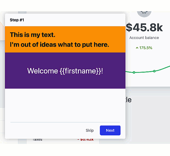
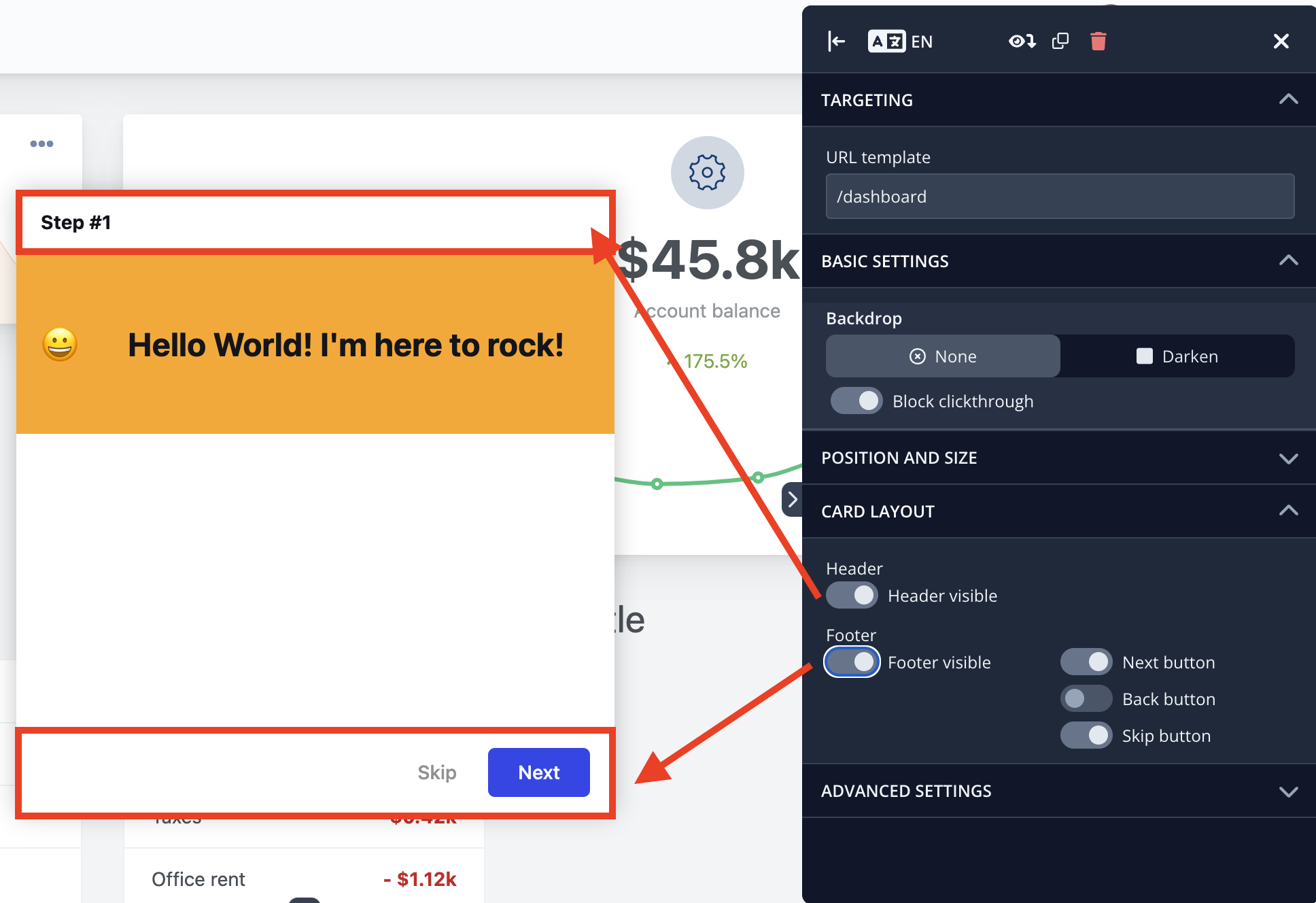
You can customize certain visual aspects of each card individually in the editor (this overrides the Look & Feel template). You can change the color of the background and text, the padding, or the vertical alignment of each section of the card.
Sections
Each card consists of sections. Each section can contain different types of content, such as text, video, an adoption meter, or Typeform.
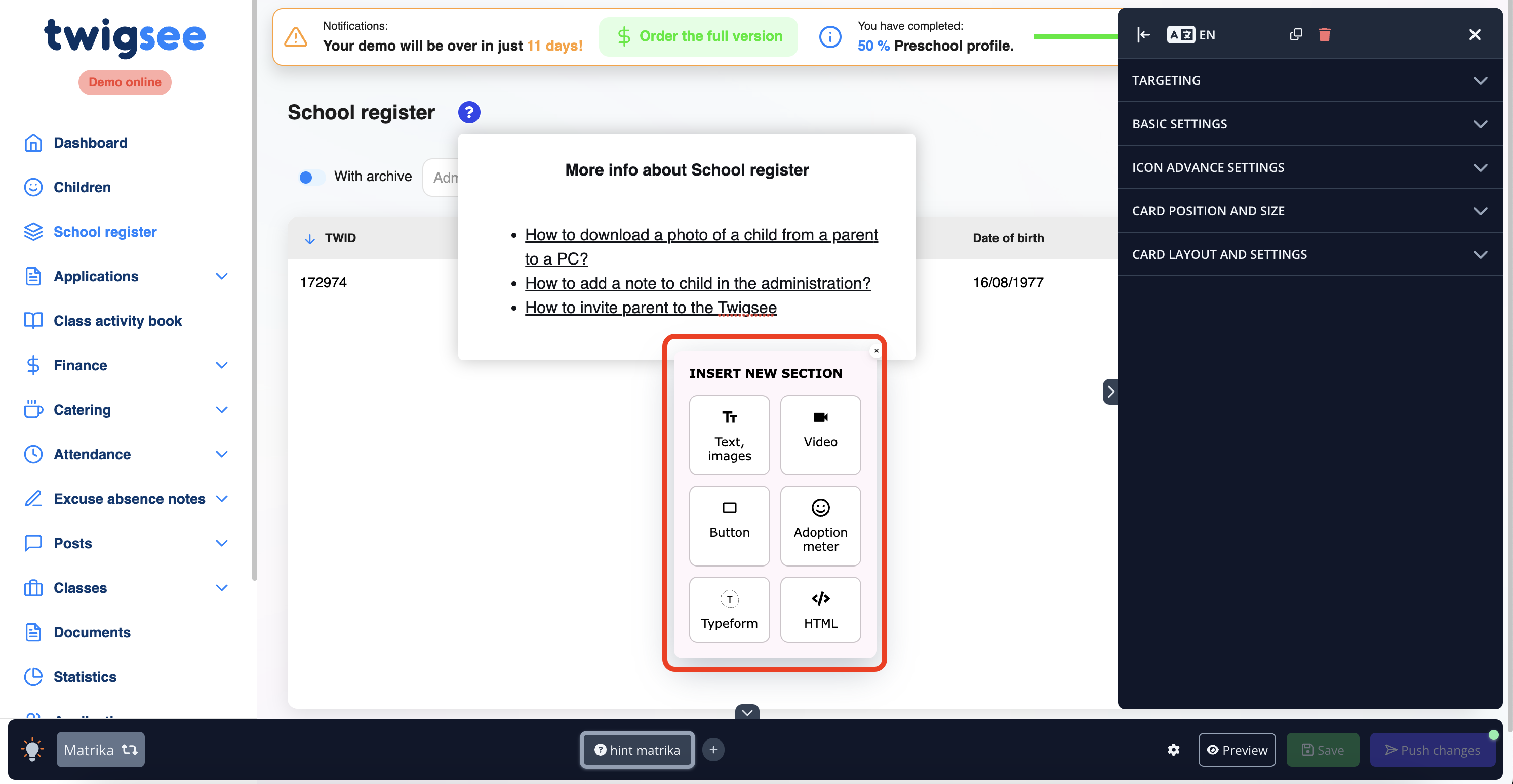
You can rearrange the Sections by dragging and dropping to the desired area
A Header and Footer can be added to each card
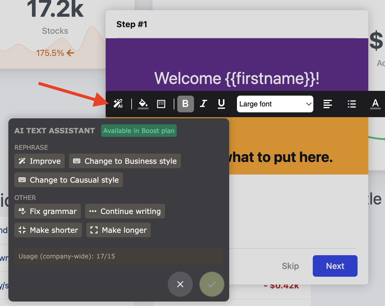
The AI Text Assistant helps you write and enhance your content
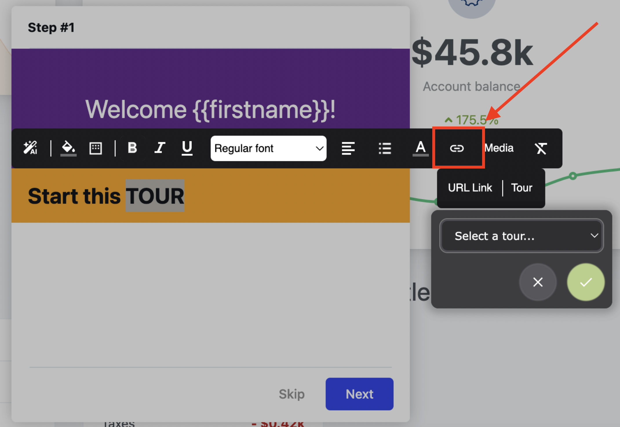
You can add a URL link or even start a Tour from either text or a custom button
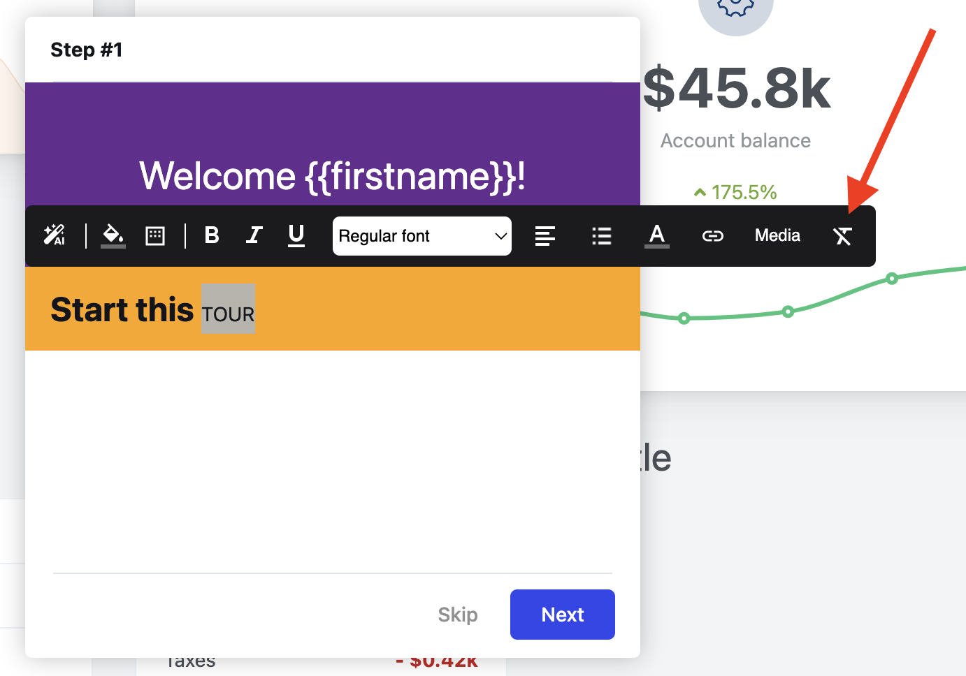
You can also reset the formatting and start over
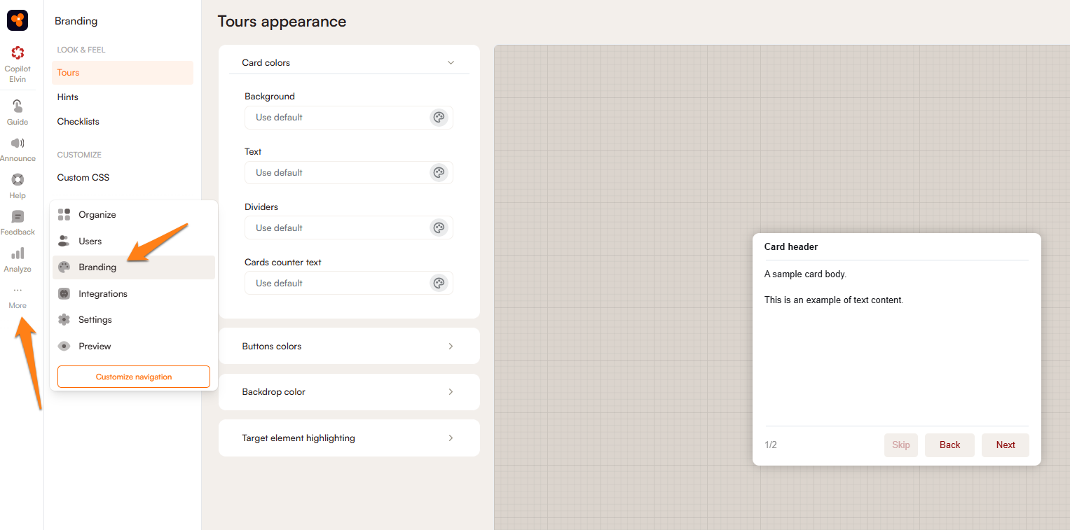
The visual template of tour & hint cards
You can create a design template matching your application's design in the Branding section in the administration. When working in the editor, all cards will begin with the default values in this template.
To find the Look & Feel menu, click on the More icon on the left side of the Product Fruits administration and then click on Branding. This will lead to a list of your tours, hints, and checklists accompanied by the CSS customization.