Tour Editor Part 3: How to Position and Size Your Tour Cards
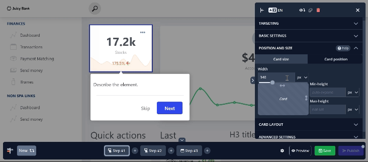
Card Size
Each size option offers a choice between a sliding scale and a manually entered pixel value. As the width is adjusted using the sliding scale, you can see the card update in real-time. The height settings allow you to specify both a minimum and maximum height for the card, using either pixel values or percentages.
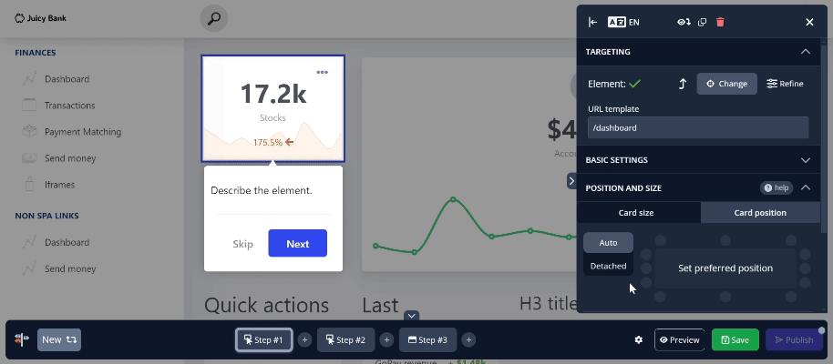
Card Position
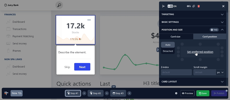
In the Card position tab, there are a few more options concerning where the tour card is located. You can change the card's automatic position to your preferred setting.
With smaller targets, the difference may not be very noticeable. However, when switching to a larger target, it becomes much more apparent.
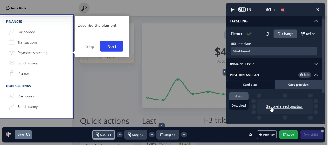
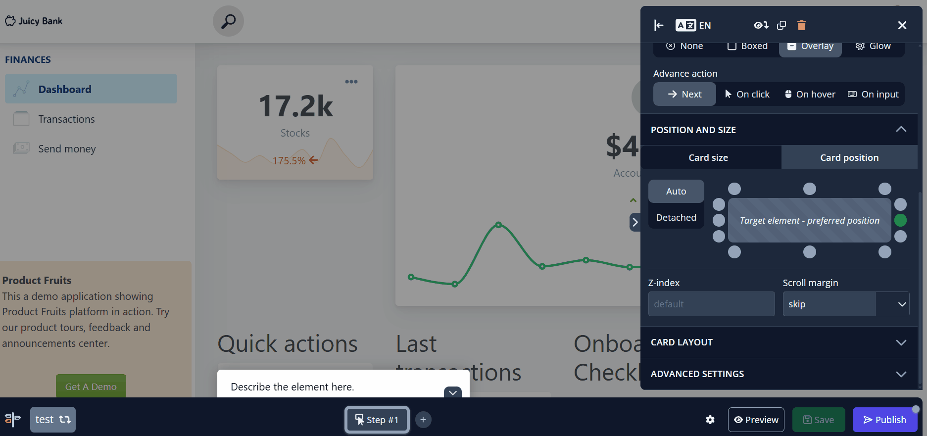
Detached offers nine areas on the screen that are completely independent of the selected target. This can be particularly useful in scenarios where an element is awkwardly positioned or conflicts visually with something else on the screen.
Z-index controls which elements appear in front of or behind others on the page—think of the page as a stack of layers. A higher z-index places the card on upper layers, while a lower value pushes it behind other elements. Most page elements use a base z-index of 0, and negative values will usually appear behind all other elements.
By default, Product Fruits cards have a high default z-index of 10001010, ensuring they appear above almost everything else on a given page.
If your card is covering something it shouldn’t, you can lower its z-index.
To place a card between two elements, check their z-index values in your app and experiment with a value somewhere in between the two until the card appears in the right layer.

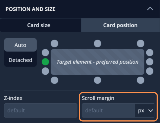
Scroll margin sets the space between the target element and the nearest edge of the viewport. It accepts pixel or percent values, which control how far the element appears from the edge when scrolled into view.
In addition to numerical values, you can also type keywords directly into the field. These keywords control how scrolling behaves when the highlighted element is not currently visible in the viewport (e.g., lower on the page and requiring scrolling).
Valid keyword values:
skip - No scrolling occurs, the user must scroll manually to reveal the element.
jump - Instantly jumps to the element without animation.

center - Scrolls to the element and positions it near the center of the viewport.
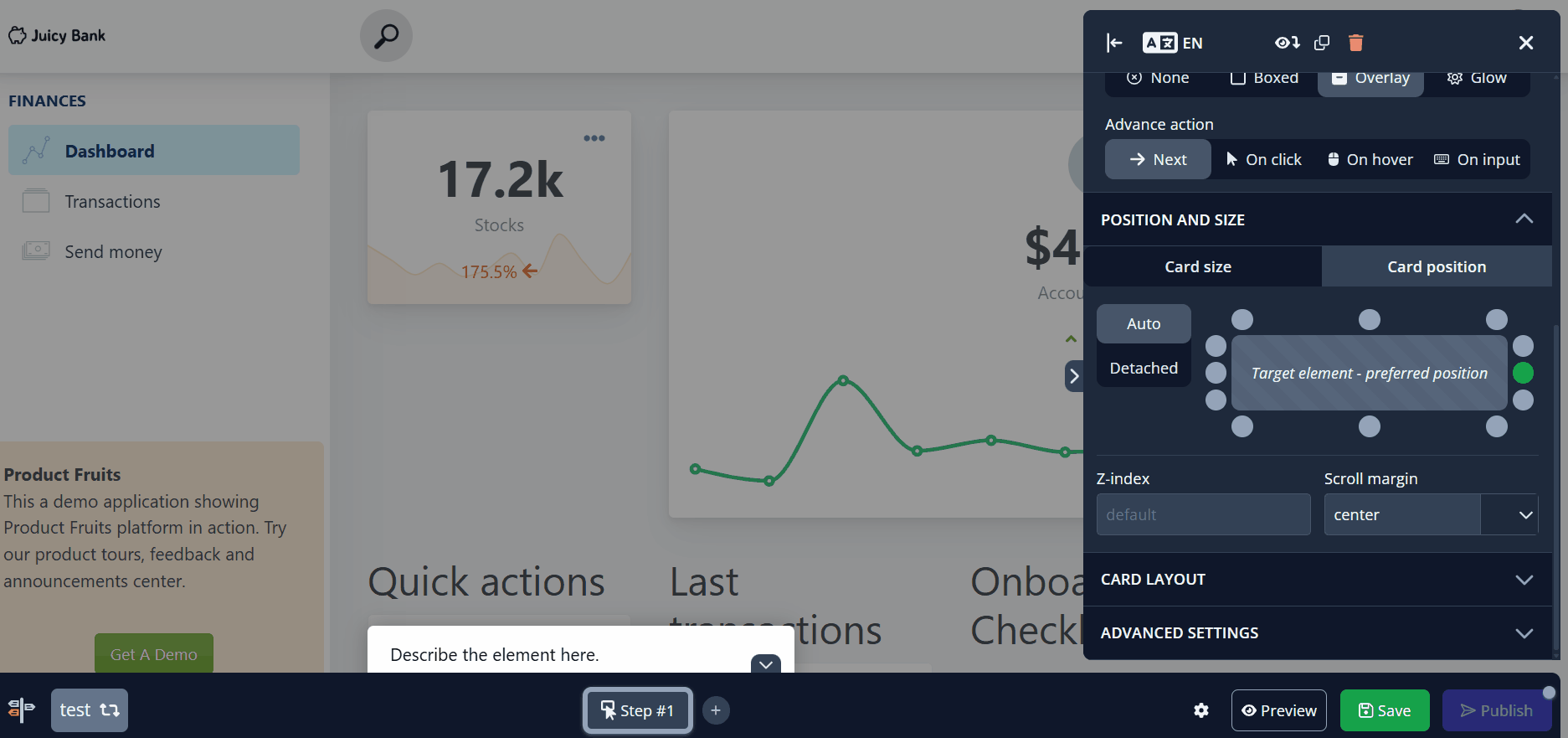
scroll - Smoothly scrolls to bring the element into view (resulting position may vary).

Please note: These keywords must be typed into the field just like a numerical value would be. The scrolling effect will apply after saving, even though the field may not make that obvious at first.