Custom launcher for the Life Ring Button

Here’s a guide on how to implement a custom launcher using the Product Fruits API. This method allows you to seamlessly integrate it with a button or another element within your app, providing a cohesive user experience. Below, you can view a GIF of a simple example implementation.
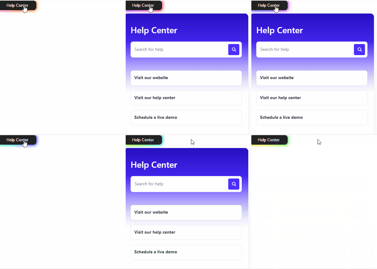
GIF showing an example of a custom launcher for the Life Ring Button


Custom launcher for the Life Ring Button (current version)

Start by including the hideInAppCenterLauncher argument set to true in your Product Fruits initialization script. This ensures that the default launcher is not visible when Product Fruits loads.

      $productFruits.push([
        "init",
        "WORKSPACE_CODE",
        "LANGUAGE_CODE",
        {
          username: "USERNAME",
        },
        { hideInAppCenterLauncher : true }
      ]);

Next, create an HTML element that will act as your custom launcher. 

<button id="customLifeRingLauncher">Launch Life Ring</button>

To ensure that the Life Ring Button operates correctly and only once the API is fully ready, we utilize the productfruits_ready event listener.

Next, use the attachToCustomElement(elementInstance) method to target an element that should be opening and closing the life ring button. The API method handles opening and closing the Life Ring automatically afterwards.

Here’s the integration setup:

window.addEventListener('productfruits_ready', function() {
    var customLifeRingLauncher = document.querySelector('#customLifeRingLauncher');
    window.productFruits.api.inAppCenter.attachToCustomElement(customLifeRingLauncher);
});

The positioning of the Life Ring modal can be changed with Custom CSS

.pfruits-button-popup {
    top: 100px !important;
    left: 100px !important;
}

Custom launcher for the legacy Life Ring Button (legacy version)

To maintain a clean and focused user interface, make sure the default Life Ring Button is not published. This step is necessary to hide the built-in launcher, allowing the Life Ring to only be accessible through your custom launcher.

Create an HTML button that users will interact with to control the Life Ring Button. 

<button id="toggleButton">Toggle Life Ring</button>

Add a function to toggle the state of the Life Ring Button based on its current state. This function checks if the button is open and closes it if so, or opens it if not. Assign the Life Ring Button API call to a variable and declaring a boolean variable to track whether the widget is open or not. 

function toggleButton() {
  if (isButtonOpen) {
    button.close();
    isButtonOpen = false;
  } else {
    button.open();
    isButtonOpen = true;
  }
}

Set up an event listener on your custom HTML element to execute the toggle function when clicked.

document.getElementById("toggleButton").addEventListener("click", toggleButton);

Full example:

const button = productFruits.api.button;
          let isButtonOpen = false;
          function toggleButton() {
            if (isButtonOpen) {
              button.close();
              isButtonOpen = false;
            } else {
              button.open();
              isButtonOpen = true;
            }
          }
          document
            .getElementById("toggleButton")
            .addEventListener("click", toggleButton);


An example of executing the toggle function when clicked to launch the Life Ring Button


Use Custom CSS in your workspace's Branding section to specify where the Life Ring modal will appear. The following CSS snippet pins the modal to the bottom right corner of the screen:

.productfruits--lifering-modal {
bottom: 25px !important;
right: 25px !important;
top: auto !important;
left: auto !important;
}