
How to Design Tours for Mobile Web
A lot of web applications have their own mobile version. Not only is the UI (typically) different with much less space on the screen, it's also possible for the elements on the mobile version of the editor to require different CSS selectors. Therefore, in most applications, it's best to design a different tour for the mobile version.
Segmenting tours based on device type
- Go to the tour details by clicking on the tour name in the tours list.
- Find the Targeting section and click Custom Rules
- In this section, click on Add condition and select Device type
- Select the is operator and select Mobile
Now the tour is ready to be displayed on mobile version only.
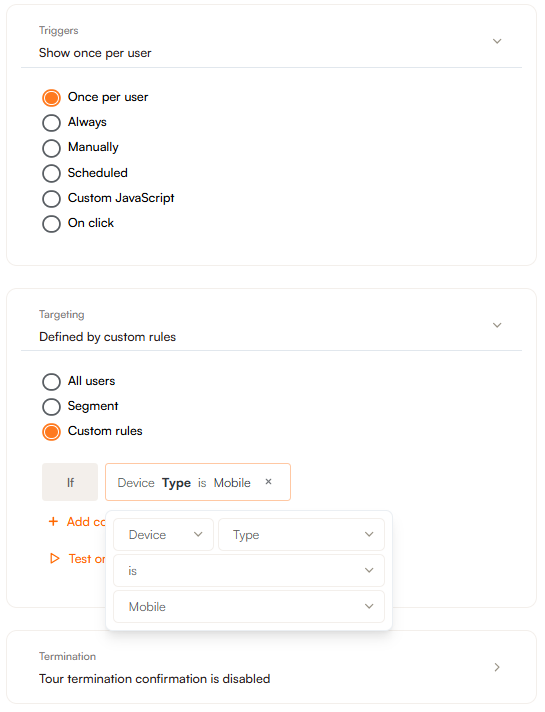
We consider the device to be mobile when the viewport width is lower than 768px.
Designing the tour
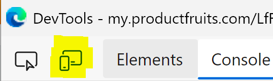
We recommend using Chrome DevTool's built-in device emulation mode. It allows you to view your application as it would appear on a real mobile device.
- While the editor is open, open up Chrome DevTools. There are several ways to do this:
- Turn on the function key and press F12
- Ctrl/Command + Shift/Option + I
- Right-click somewhere in the web application and select Inspect in the dropdown menu
- In DevTools, click on the Toggle device emulation button. It is the second option in the top left. If this option is not present please see the note at the bottom of this article.
Now, the device emulation mode should be on. You should see something similar to this:
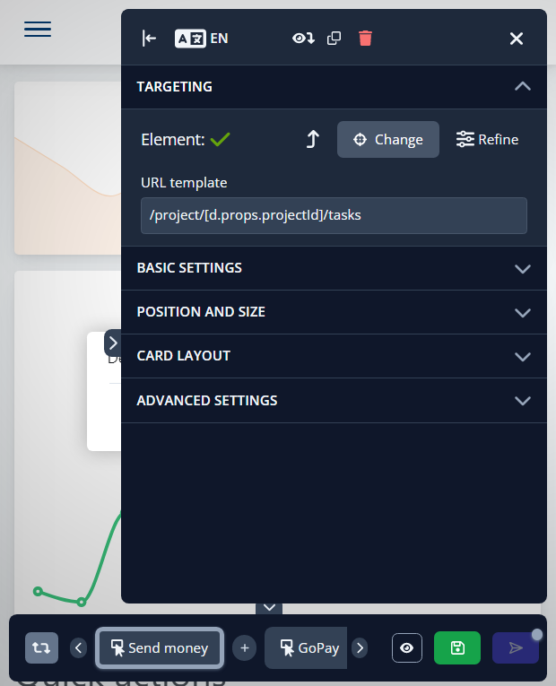
If the editor is taking up too much of the viewport, select Responsive from the Dimensions dropdown at the top and adjust the size of the emulated viewport.
If the option for entire mobile emulation mode is not present, please try navigating directly to the page where you'd like to edit the tour in a new tab and launch the editor from your extensions tool bar. As seen below:
