
Analytics Overview
Do you want to know how well your onboarding content is performing? Maybe which hints are most visible, or how far a user makes it through an onboarding flow before losing interest. Product Fruits has built-in analytics that can give you insights on user behavior and content performance.
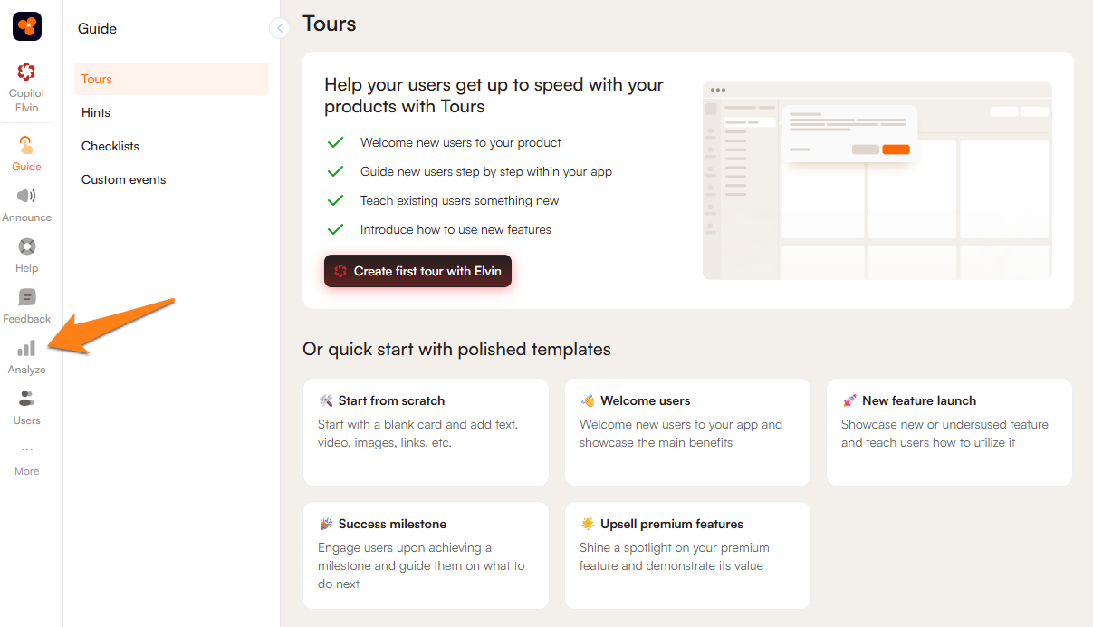
Start by navigating to the Analyze tab in Product Fruits administration:
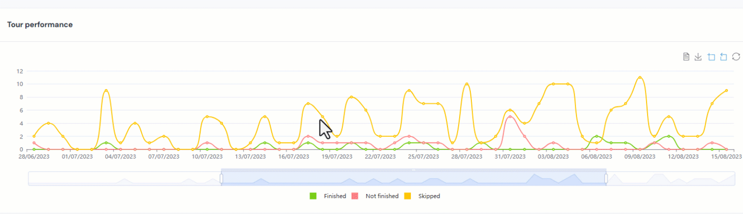
Tour Analytics
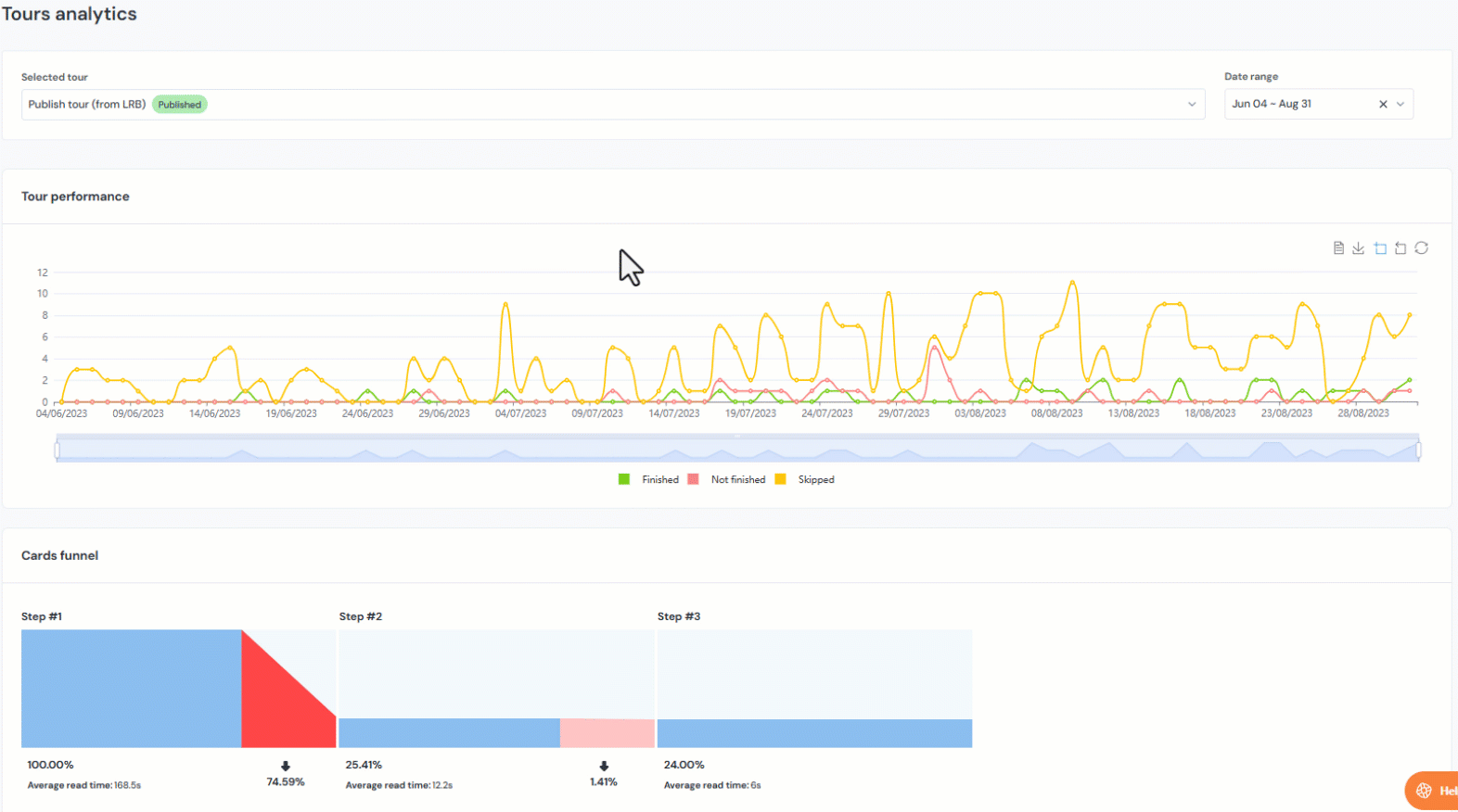
Select a tour from the dropdown menu in Tours analytics. The dropdown shows recent items; it may be necessary to start typing the desired tour to view it.
You can set a date range to observe the tour analytics for a specific time span, and then analytics for tours will be displayed on the graph with how many times the tour was finished, not finished, or skipped. This data can be toggled to only show one of these data types on the graph. The Cards funnel graph displays how long users take to read a specific card, percentage of users who finish the card, and ultimately finish the tour.
Using the graph
There are several useful features for the graphs in the analytics section:
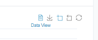
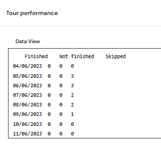
- Data view allows you to see the graph data in text format. This data can be copied for convenience.
- Save as image saves the graph as an SVG file, and saves the same way you are viewing it. If you have zoomed into part of the graph, it will save the zoomed in version.
- Zoom allows you to zoom into a portion of the graph that you select. You can zoom into the graph multiple times to narrow down the portion you'd like to view.
- Zoom reset will allow you to "zoom out" one time, while restore will change it back to the version showing your entire selected date range.
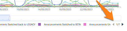
Additional items on the graph may be on extra pages, depending on the amount of content you have:
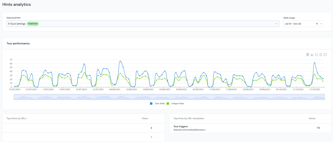
Hint Analytics
Hint analytics show a graph of the total number of visits of the hint, as well as how many of those visits were unique. The lower half of the page shows which URLs and URL templates the hints were viewed on.
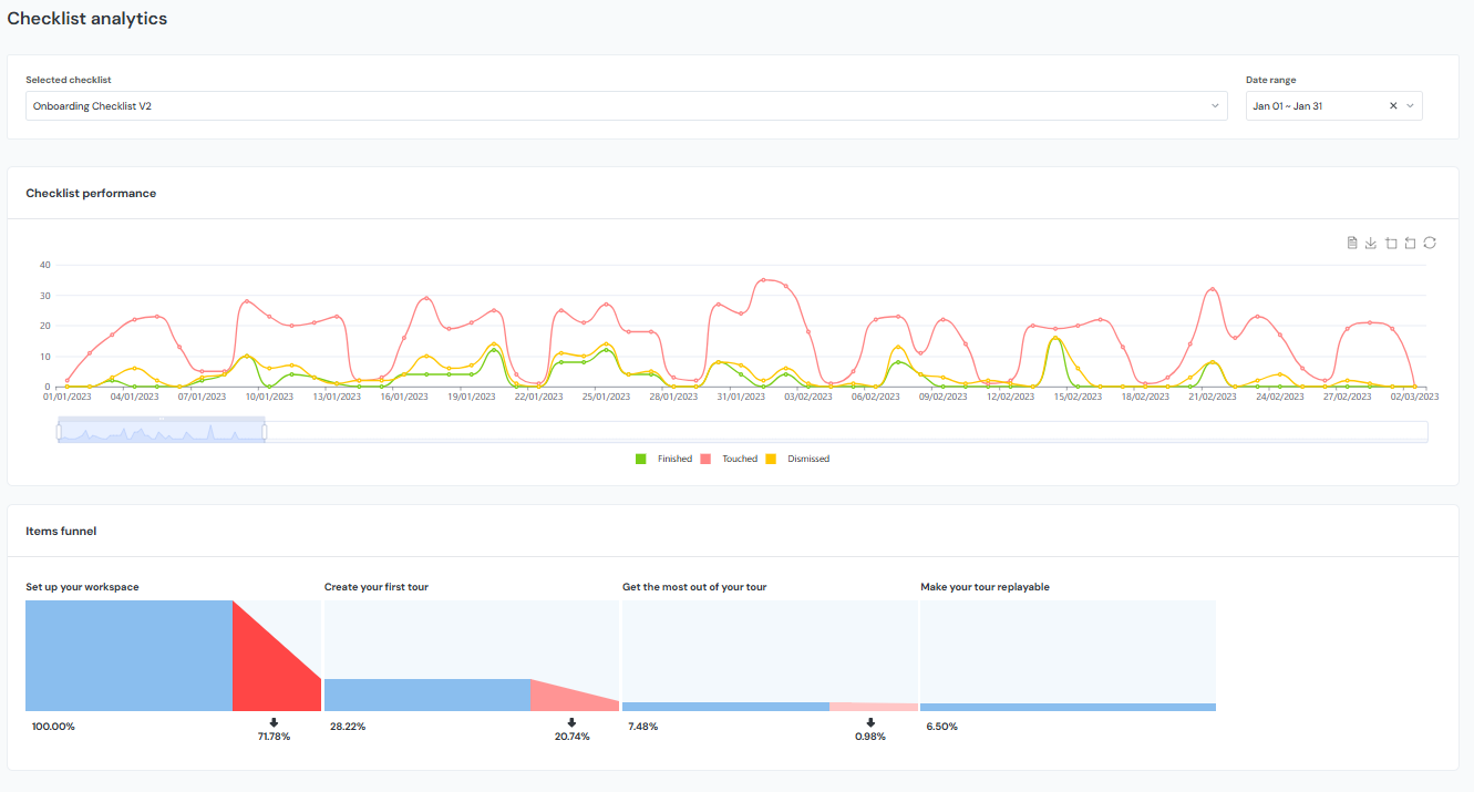
Checklist Analytics
The checklist analytics graph shows how many times the checklist itself, and specific checklist items, were finished, touched, or dismissed, and also includes an items funnel that shows where users continue or drop off of the checklist onboarding journey.
'Touched' means that the checklist has been interacted with and at least one item from it has been completed. 'Finished' will show when checklist items have been completed and will correspond with the number of checklist items that have been completed. 'Dismissed' will show the number of times a checklist was dismissed by unique users.
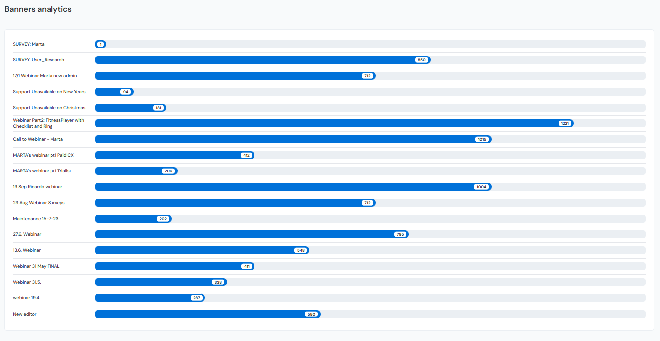
Announcement Analytics
Banner, newsfeed, and pop-up analytics all show the total number of times that the announcements are viewed:
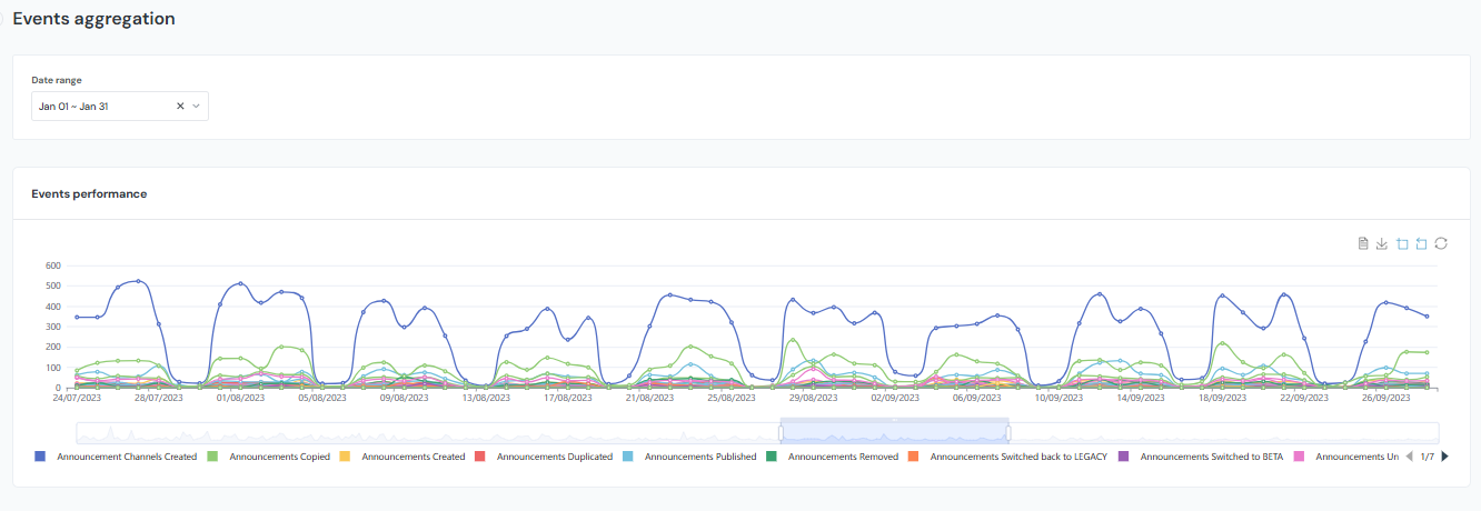
Tracked Events
Tracked event analytics have a graph similar to tours, hints, and checklists and will show the number of times an event has happened:
Articles
When checking article analytics, you can choose between search keywords and views of individual articles.
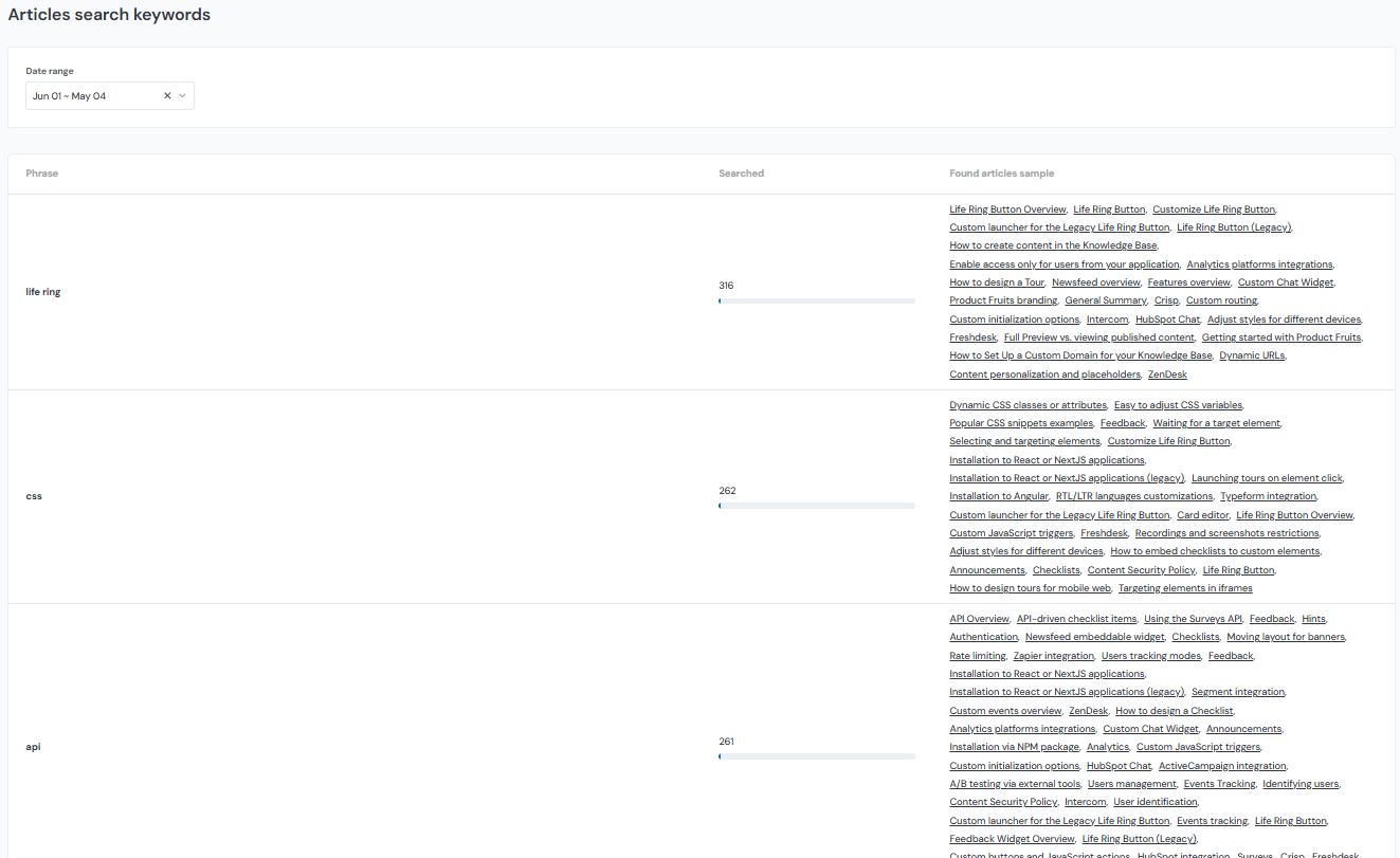
Search keywords
You can view which keywords your users are searching for in your Knowledge Base, and what results come up from this search. This information can give you a good idea of what users have questions about, and what information may need to be added to your Knowledge Base:
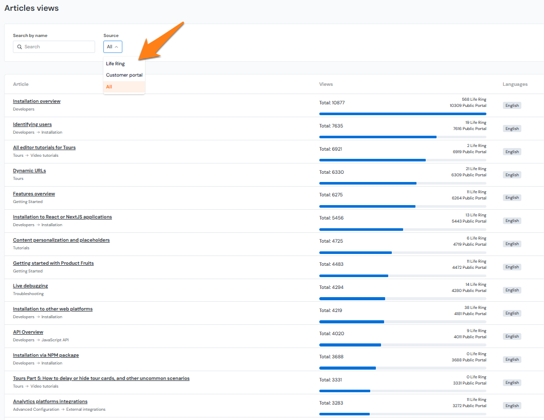
Article Views
Check which articles in your Knowledge Base are frequented the most. Search by the name of the article, or filter by the source of where users are accessing them:
Adoption Meter
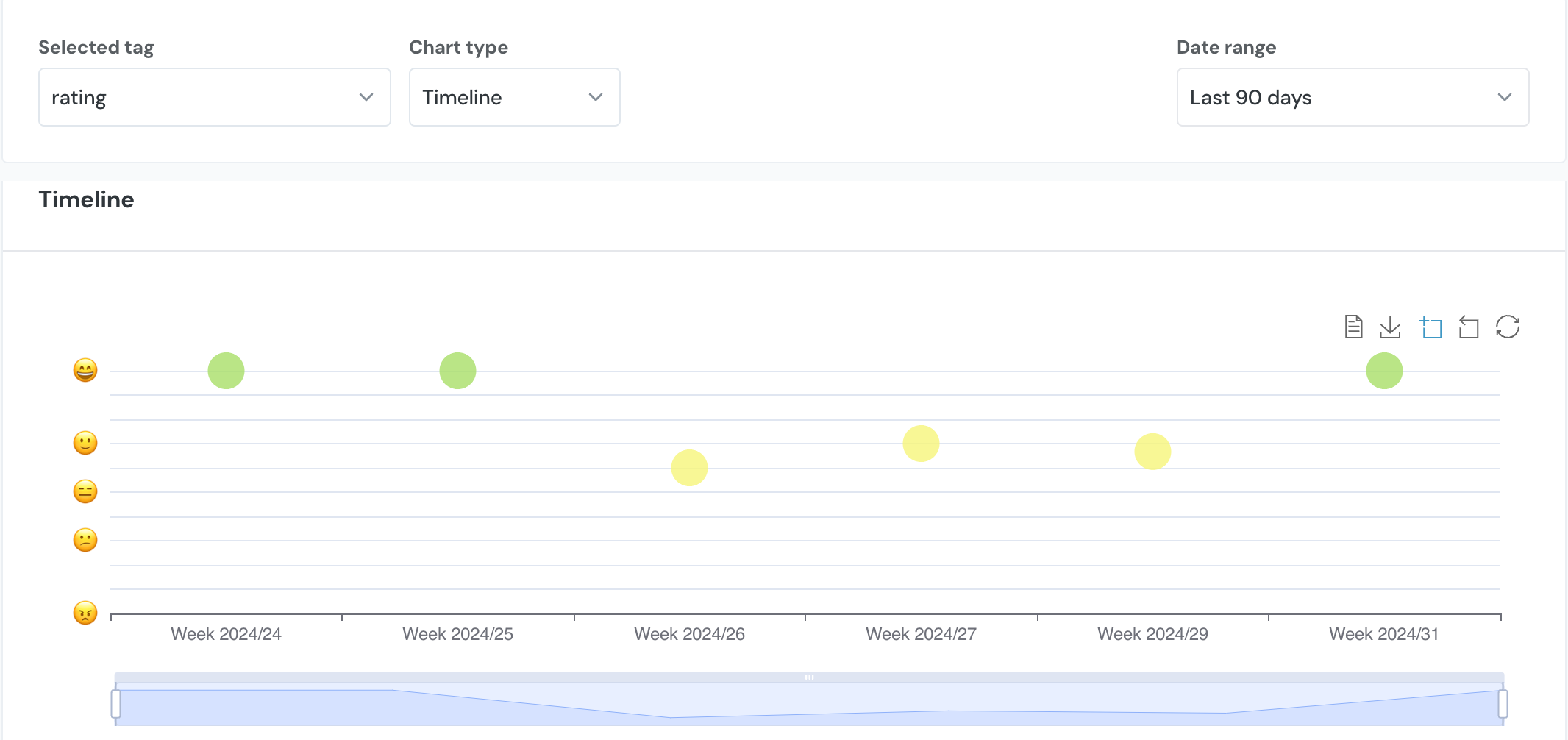
There are also adoption meter analytics. To view them, you must select a tag from the selected tag dropdown. There are two chart types to choose from: Ratings and Timeline. The Ratings chart type shows the ratings in bar graph form as shown below. A total count of each rating and percentage of each rating from the total responses are included in this view.
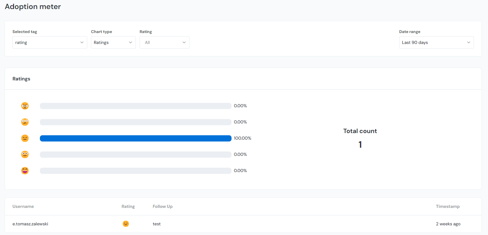
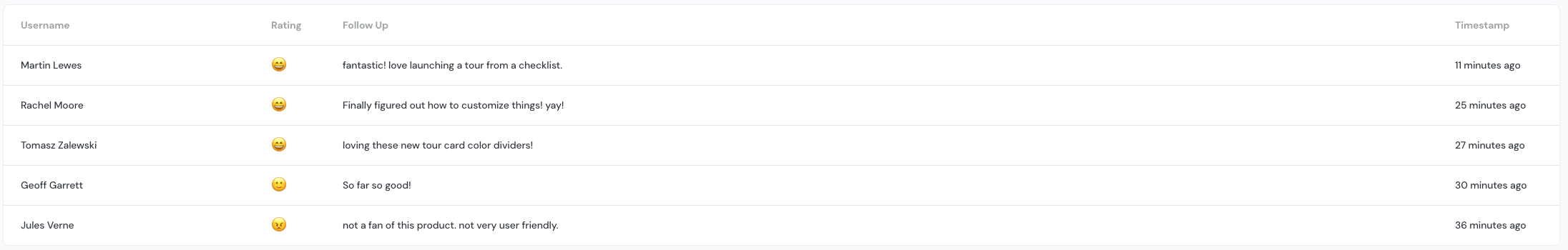
At the bottom of the page, you can see individual adoption meter submissions.
The timeline view of the adoption meter analytics graph shows when the ratings were received. The ratings themselves are shown along the horizontal access with the colored dots seen on the graph itself indicating the date. A number will show when you hover over the colored dots. This is the associated rating given by users on the adoption meter itself. The adoption meter values are on a scale from 0-10 and you will see these values reflected numerically on the chart. If you get multiple adoption meter ratings in the same day you will see the average of those submissions as a numerical value. You can also filter by the type of rating and date range:
Survey Analytics
For most features, analytics can be accessed via the Analyze tab. However, survey results are located in a different section. Learn where to view them here.