Tour Editor Part 4: How to Create Different Layouts of Tour Cards
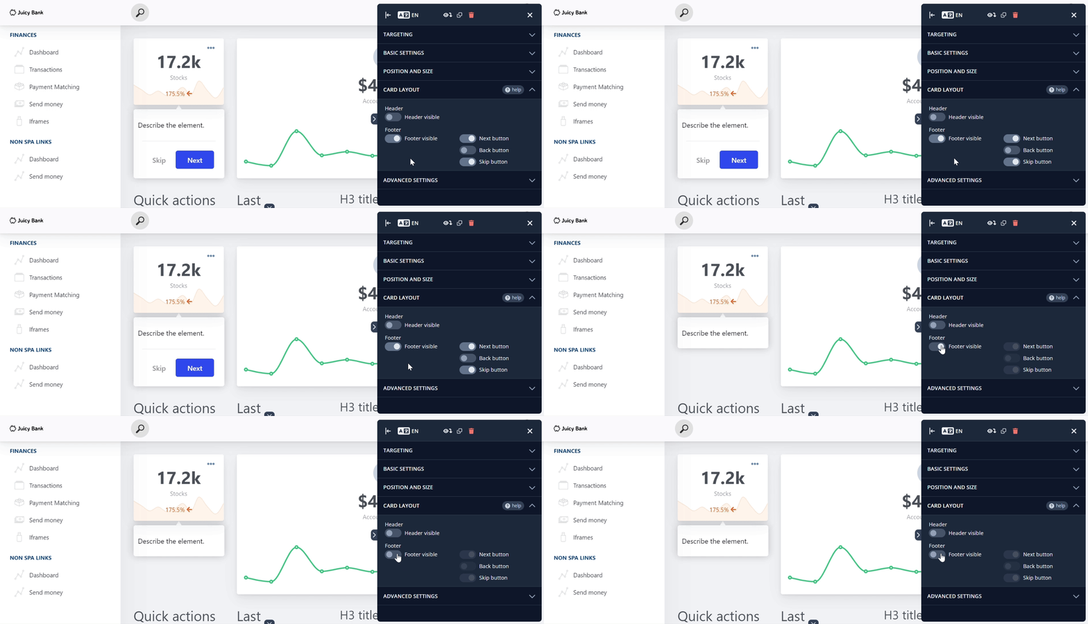
The Footer is enabled by default and includes both the Skip and Next buttons. If the footer is toggled off, these buttons will no longer be visible. (Remember in the Basic Settings article when the Skip button was turned off while demonstrating the tour proceeding on click? That was no magic trick!😉)

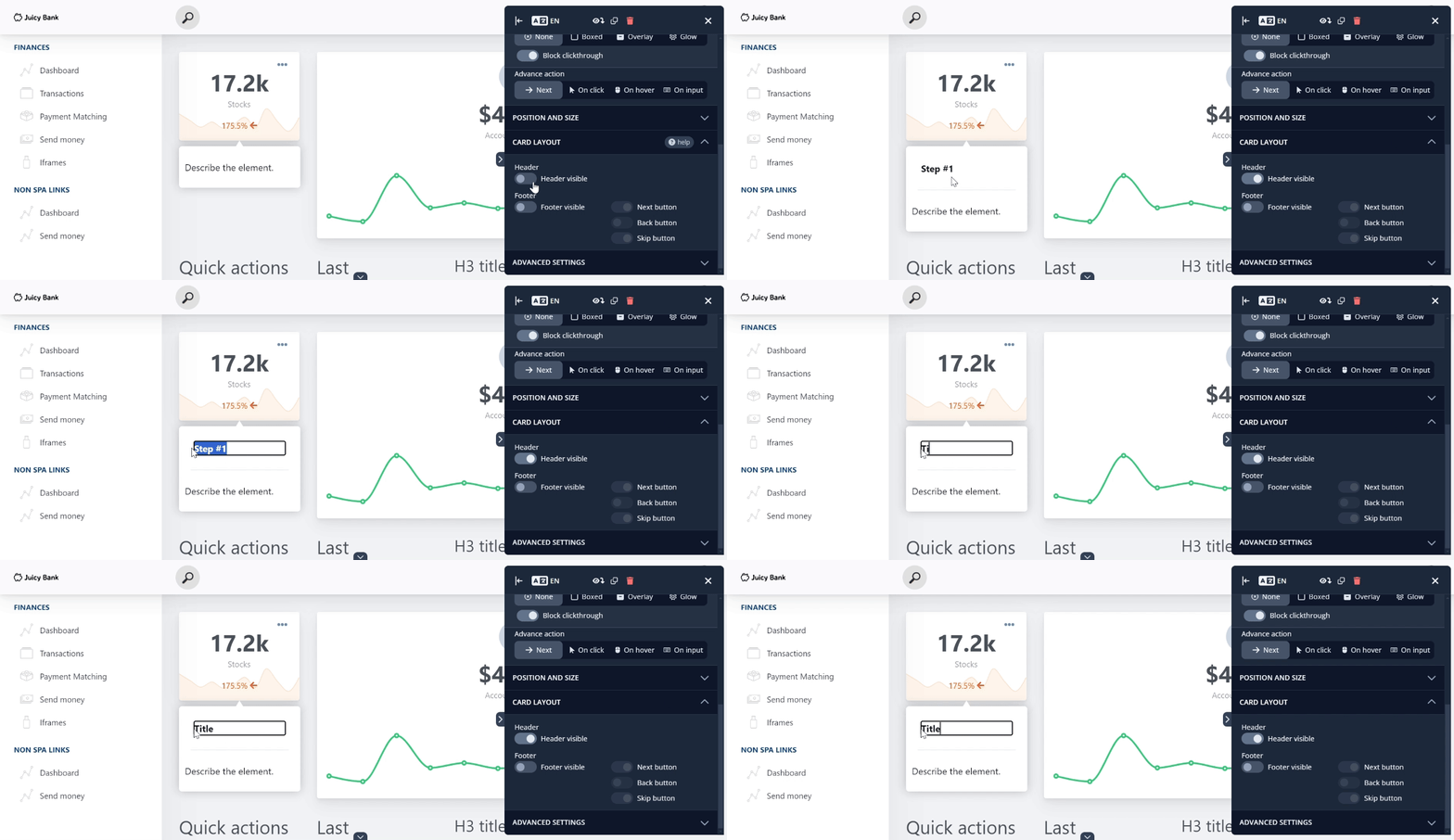
The Header is the positional opposite of the footer. When enabled, it functions as the title for the card.

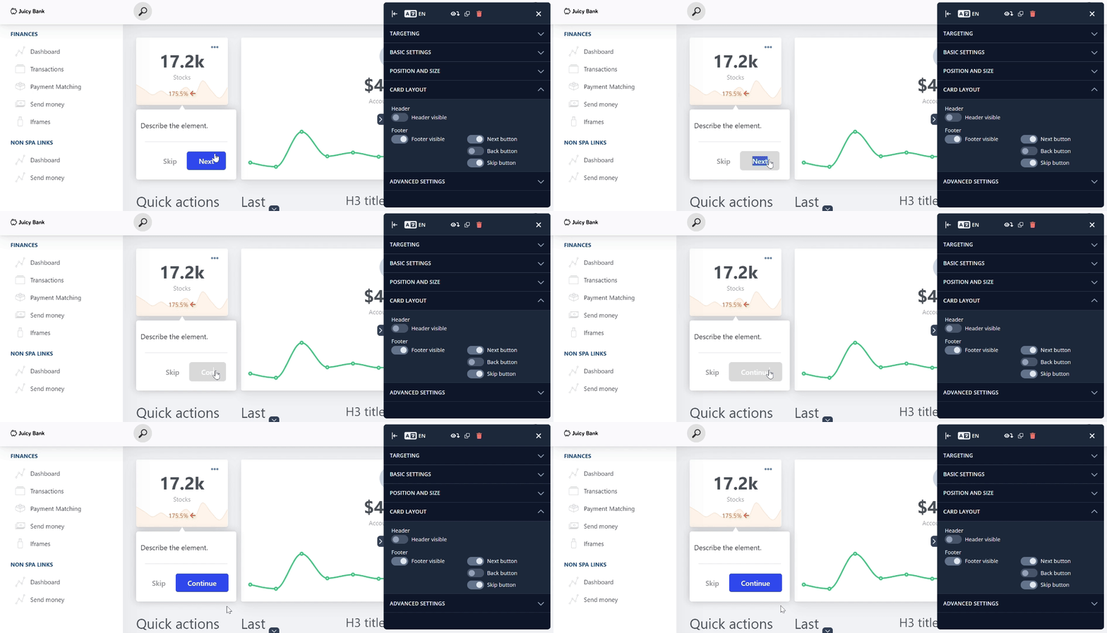
The button labels can be easily customized too; simply click inside the button and type in your preferred text to replace the default wording.

When certain conditions apply, such as on the final card or at the tour’s start, the Skip, Next, and Back button toggles will appear greyed out. However, they can still be turned on, which would cause specific behaviors: if the Skip or Next buttons are enabled on the final card, the tour will end, and if the Back button is activated at the beginning, it will prevent the tour from moving forward.
