
Editing your content
To launch the editor mode, open a new tab in your browser and enter your application's URL. When your application is loaded, click on the Edit button in the extension popup.
You should see the content selector:
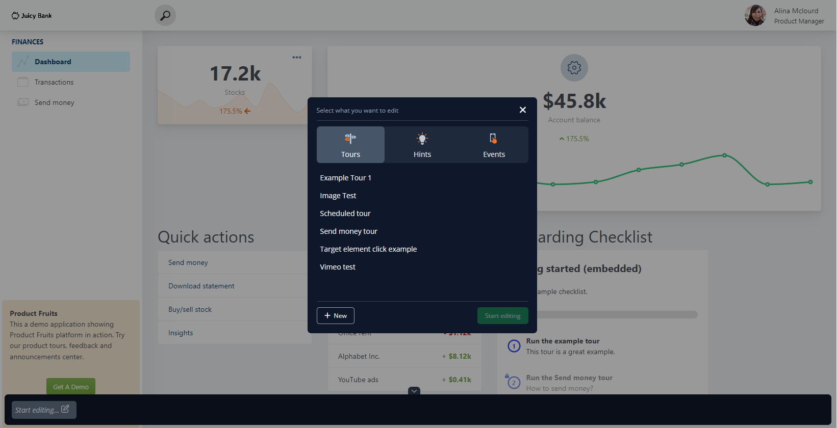
The editor allows you to edit:
- Tours
- Hints
- Custom events (in the Pro and legacy Boost plan)
Select the item you want to edit or click on the New button and create it from scratch. We will be using a tour as an example in this article.
Editor interface
When you select or create something to edit, the editor will load the bottom panel. In our case, we created a new tour:
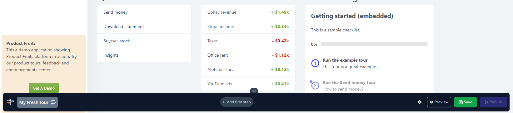
This panel shows:
- The selected item name. If you click on it, you can change what you want to edit.
- Tour steps, hints, or custom events. In this article, there is the Add first step button in the middle because we have just created a new empty tour.
- The editor settings button, which allows you to adjust editor behavior.
- The Preview button (for tours and hints), which launches the preview of the selected tour/hint group.
- Save and Publish buttons
Creating steps/hints
For an empty tour, click on the Add first step button. If you already have steps, a plus button will appear between steps to allow you to add more. The card/hint type selector will appear as shown below:
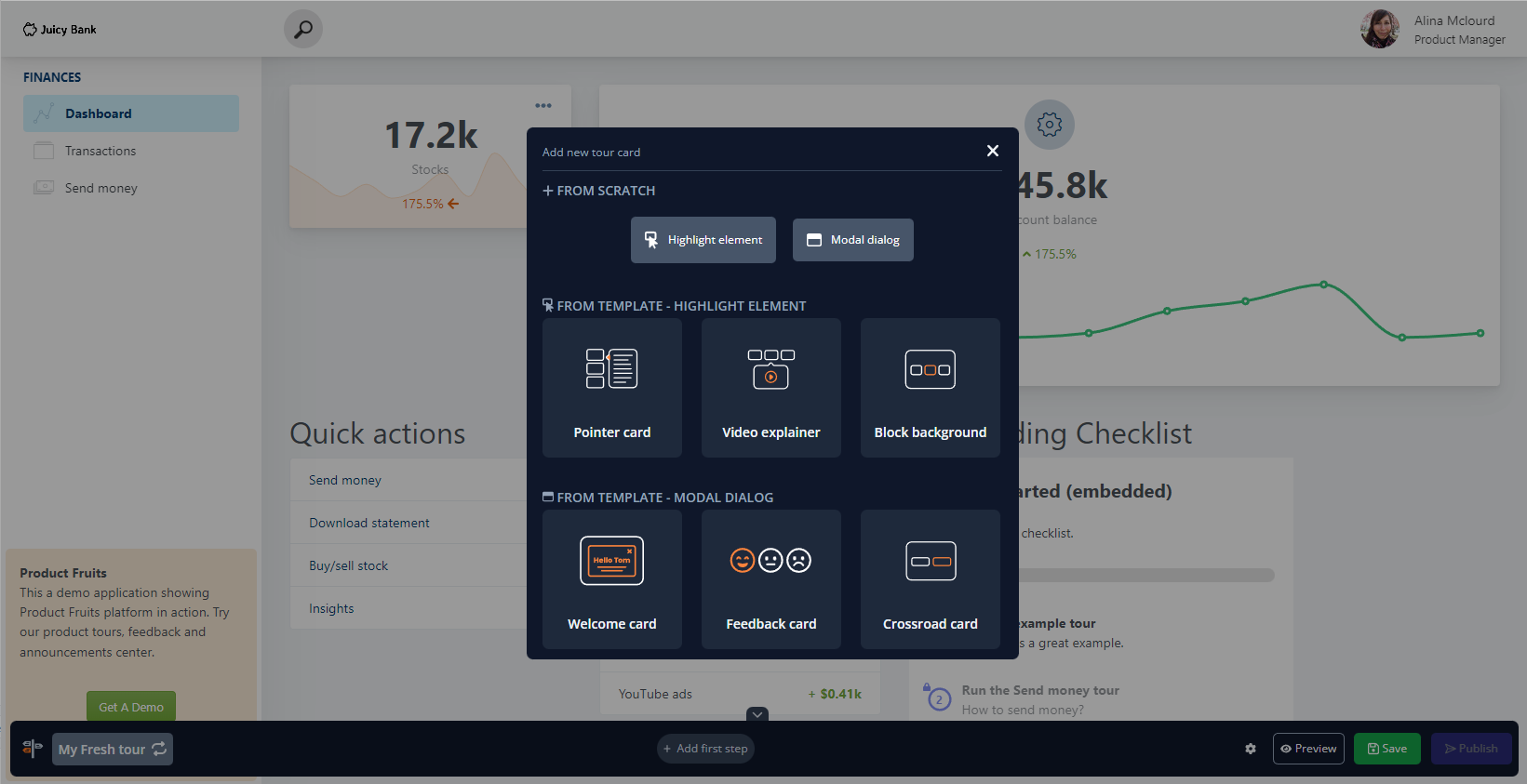
You can start from scratch by clicking one of the top buttons. If you select Highlight element (or a Hint), the next step is to choose a target element by clicking on it in your application.
We have also prepared a few useful card templates for you.
Creating custom events
Custom events have no visual representation, so when adding a new event, you will go directly into the Highlight element mode.
Editing a tour/hint card
In the bottom panel, you can:
- drag & drop cards to change their position in the flow
- double click to rename the card
- click to edit the card
When you click on the card name, the card and the item editor panel will appear:
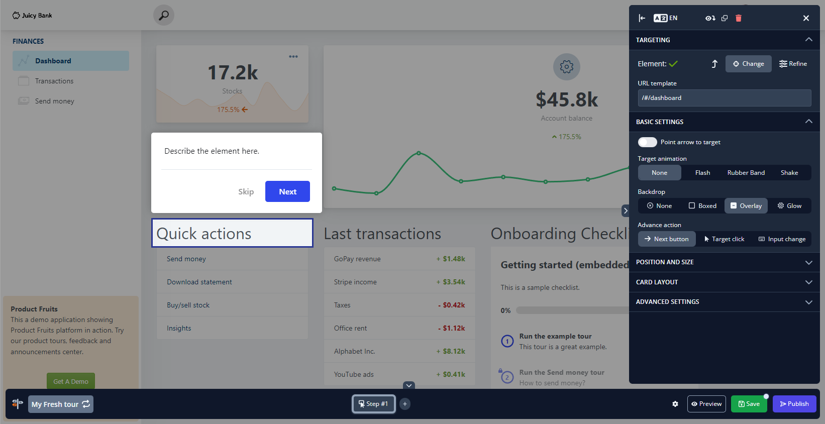
The card is editable, allowing you to put your content directly into the card. The main panel holds plenty of options you can adjust.
For example, you can change the backdrop of your card, adjust the position or size, or use any of the advanced settings, such as Advance when the element is not found.
The top of the editor has the following actions:
- Position toggle - move the panel to the other side of the screen
- Language localization - if your application uses multiple languages, switch the language here to edit the intended content
- Preview from this card (while in tours) - start the preview from the selected card instead of having to preview from the beginning.
- Clone - duplicates the entire selected item
- Delete - deletes the selected item
- Close - closes the selected card and the editor panel
Saving and publishing
When you are done with your content changes, click on the green Save button in the bottom panel. If you want to publish or push changes to your end users, click on the Publish/Push changes button.
For more actions, switch to the Product Fruits administration.