Popular CSS Snippets Examples
Custom CSS
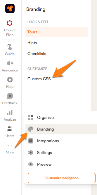
To navigate to the custom CSS input page, first click on the More icon on the bottom left of the Product Fruits administration menu then click Branding --> Custom CSS.
Custom fonts
Changes fonts for the entire Product Fruits experience (except for the Elvin Widget). Please use a font that is already present in your application as due to Product Fruits rendering its content in the shadow DOM, it's currently not possible to import a font via Custom CSS.
.productfruits--container-root {
	font-family: Arial;
}
To include Elvin in this change, the following snippet can be used:
.productfruits--container-root, #render-root {
	font-family: Arial;
}
Tours
Custom fonts
.productfruits--tour-container {
	font-family: Arial;
}
Skip button colors
.productfruits--card-footer
.productfruits--card-footer-skip-button {
    background-color: black;
    color: white;
}
Previous button colors
.productfruits--card-footer
.productfruits--card-footer-back-button {
    background-color: black;
    color: white;
}
Add a X button in the top-right of the card
.productfruits--card-header-skip-button {
    display: block; /* show the cross button */
    background-color: #441122; /* adjust the color */
    top: 15px; /* adjust the position */
    right: 15px; /* adjust the position */
}
Hide card step counter
Product Fruits automatically displays a step counter in the bottom-left of tour cards. You can hide this step counter with custom CSS.
.productfruits--card-footer-steps-counter {
    visibility: hidden;
}
Hints
Default z-index for icons
If hints are (incorrectly) overlaid on top of elements in your application, you can adjust the default Z-index settings. You should find the right value by experimenting with the number. A lower numbers mean hints will fall beneath more elements.
.productfruits--context-help-help-icon {
	z-index: 123 !important;
}
Announcements
Font Colors for V2 Banners
/* Set font color for banner text */
.banner-txt {
    color: black !important;
}

/* Set font color for banner action links */
.banner-action {
    color: black !important;
}
Change color of the Close Button in Pop-Up
.close-btn .ic path {
    fill: red;
}
Life Ring Button
Moving the position of life ring button widget launcher
.button-launcher {
 right: 25px;
 left: auto;
 bottom: 25px;
/* z-index: 10; */
}
This change can also be made in the Product Fruits administration on the life ring button appearance tab, under the positioning drop down. If not mounting the checklist from the left and right positions, it's advisable to set those positions to 'auto' or 'unset', or else the life ring button launcher may stretch from it's original position. Using !important here will prevent the draggable by user toggle from functioning.
Checklists
Moving position of checklist launcher container
.productfruits--container-pf-checklists-stacker {
 right: 25px;
 left: auto;
 bottom: 25px;
/* z-index: 10; */
}
This change can also be made in the Product Fruits administration on the checklist page of the branding section. If not mounting the checklist from the left and bottom positions, please be sure to set those positions to 'auto' or 'unset', or else you may end up with invisible divs blocking parts of your application. Use of !important may be necessary in those cases.
Removing the dismiss checklist option
.productfruits--checklist-panel-footer a {
display: none;
}
This can also be accomplished by adding only a space on the checklist localization page.