Branding
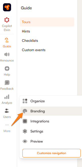
Unlike surveys and announcements, onboarding tools such as tours, hints, and checklists cannot be styled directly in the content editor. However, you can still change the color of the cards and buttons to match your branding. To customize their appearance, go to the More menu and select Branding.
Please note that changes made here apply to all tours, hints, and checklists in your workspace. It is not possible to style elements individually in this section of Product Fruits.
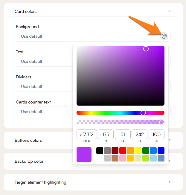
All color settings in the Branding section can be adjusted by clicking on the palette icon next to each field. This opens a color picker where you can manually select a shade using the gradient scale, or enter a specific color value using HEX or RGB codes. Below the color scale, there is also a transparency slider that allows you to adjust the opacity of the selected color.
Tours
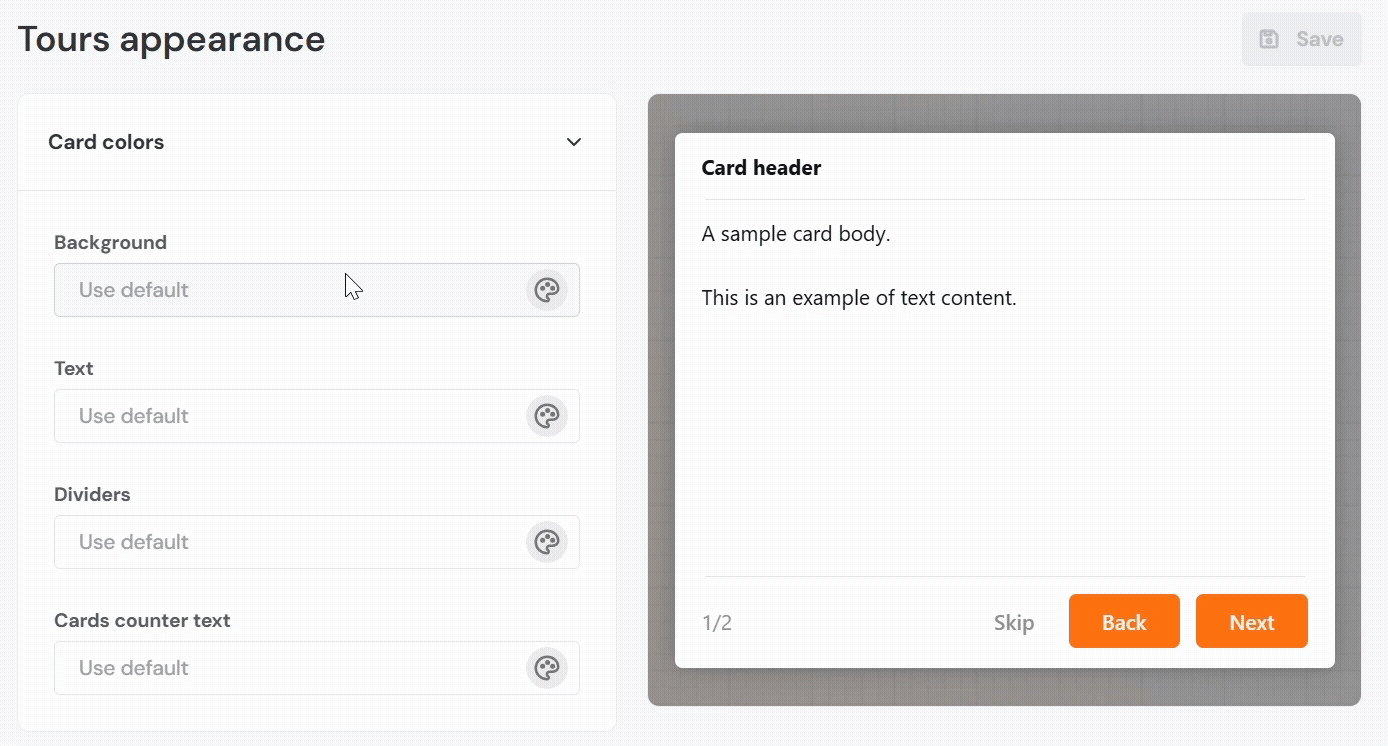
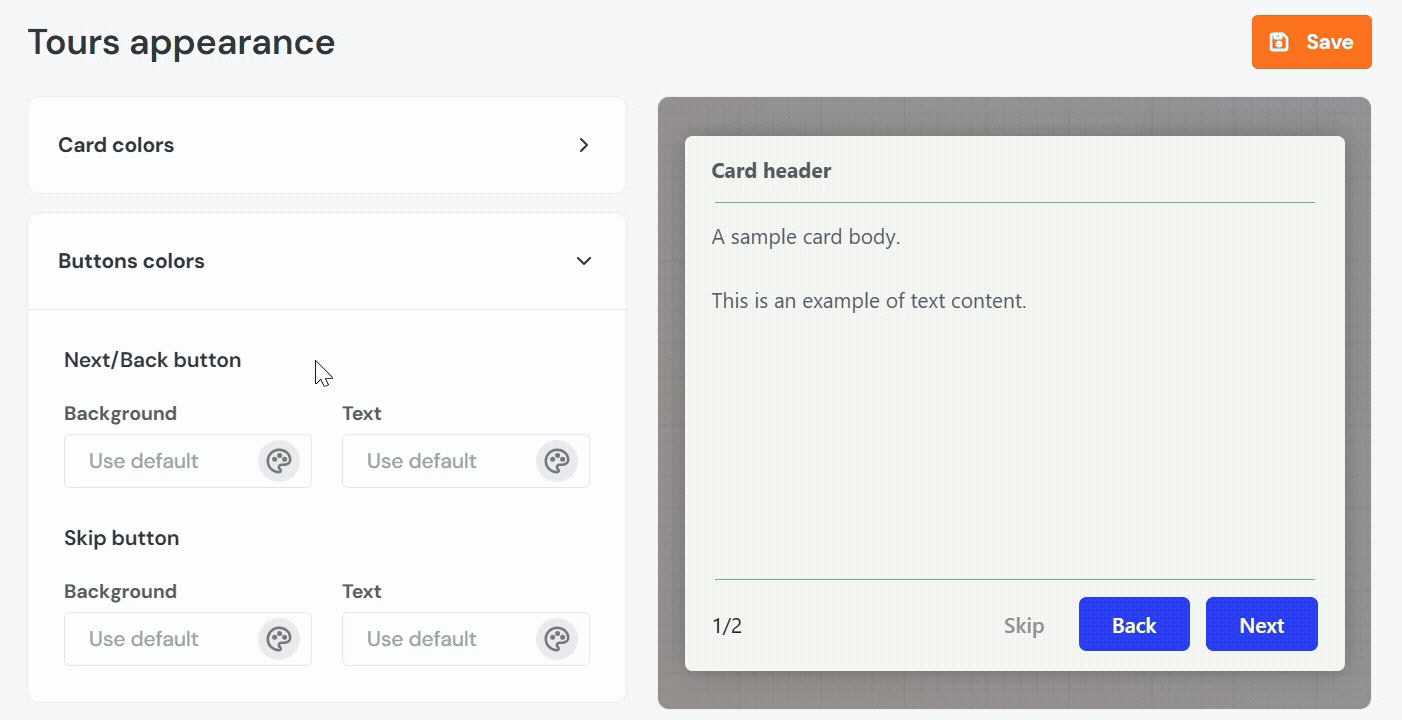
Card Colors
- Background: Sets the background color of the tour step card.
- Text: Defines the color of the text displayed inside the card.
- Dividers: Controls the colors of any horizontal lines used to separate sections within the card.
- Cards counter text: Specifies the color of the text that displays the current step count, such as 1/2.
Buttons Colors
- Next / Back Button - Background: Sets the fill color of the primary action buttons, typically labeled as "Next" and "Back".
- Next / Back Button - Text: Sets the color of the label inside the primary action buttons.
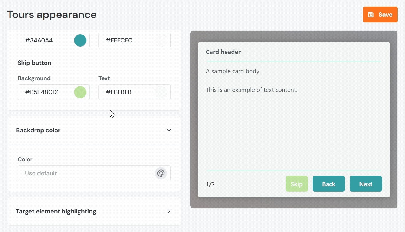
- Skip Button – Background: Sets the fill color of the optional "Skip" button.
- Skip Button – Text: Sets the text color for the "Skip" button.
Backdrop
- Color: Defines the background overlay color that appears behind the tour card to dim the rest of the interface.
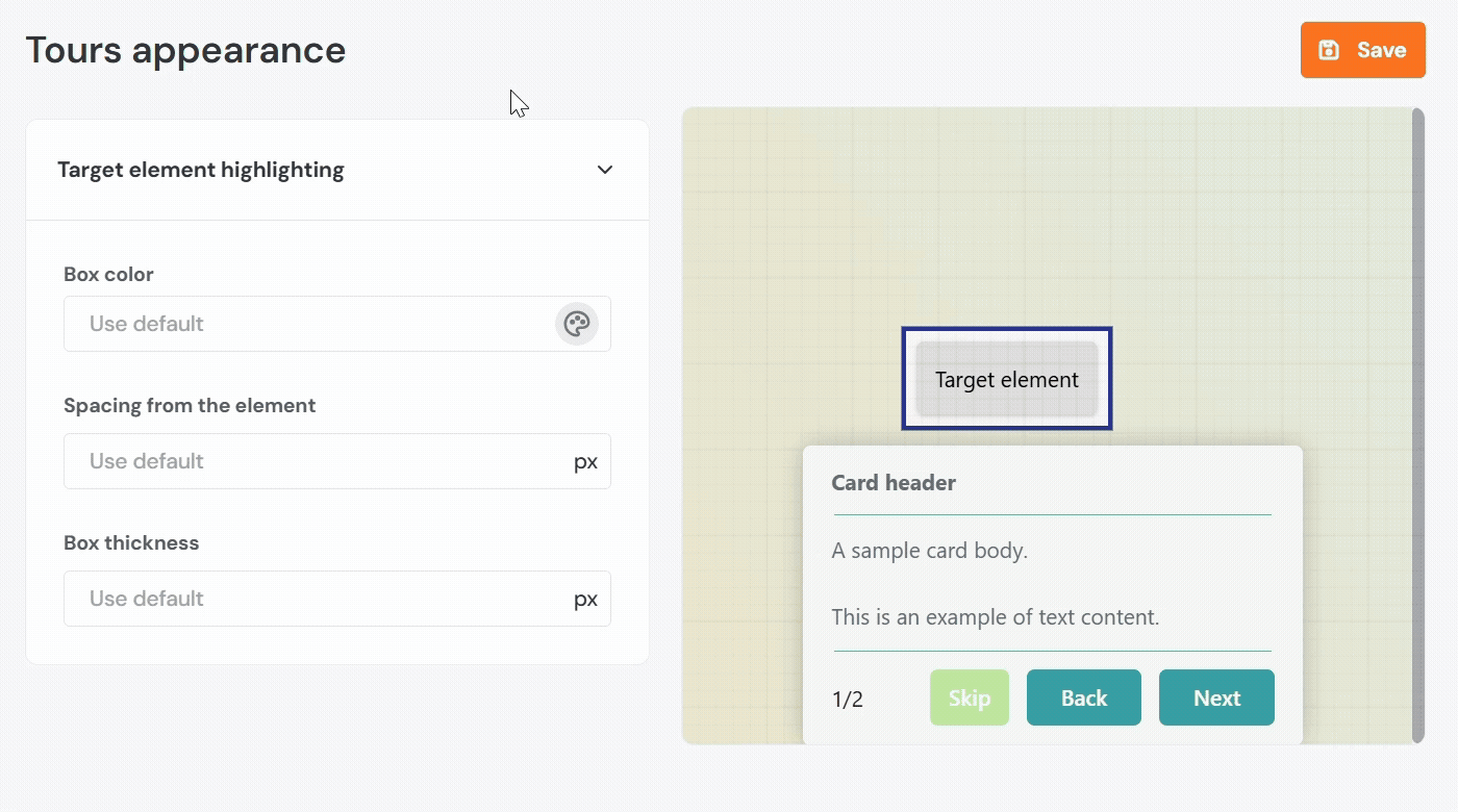
Target Element Highlighting
- Box Color: Sets the outline color that appears around the highlighted UI element during a tour step.
- Spacing from the Element: Determines the amount of padding, in pixels, between the target element and the outline box.
- Box Thickness: Defines how thick the outline border is, in pixels.
Hints
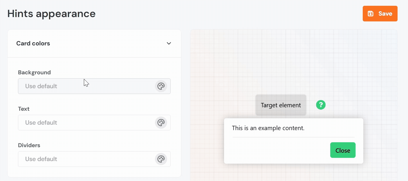
Card Colors
- Background: Sets the color of the hint card.
- Text: Defines the color of the message shown in the hint.
- Dividers: Specifies the color of horizontal lines, within the hint layout.
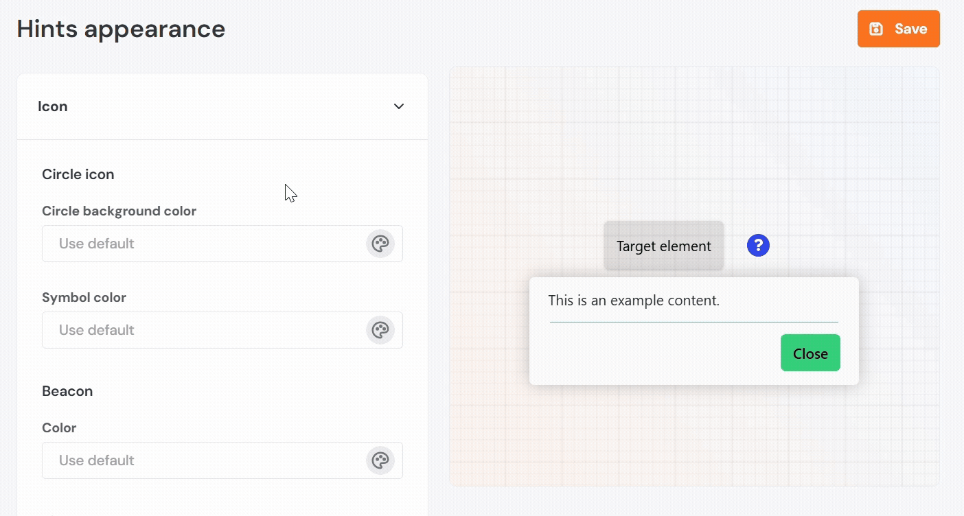
Icon
- Circle Icon – Background Color: Sets the fill color of the circular icon used to indicate the hint location.
- Circle Icon – Symbol Color: Sets the color of the icon or symbol inside the circle.
- Beacon Color: Defines the color of the pulsing animation used to draw attention to the hint.
- Beacon Size: Sets the diameter of the beacon in pixels. You can choose from small, regular, or large sizes.
 Note: The changes applied to the flashing beacon can only be previewed in the Product Fruits editor.
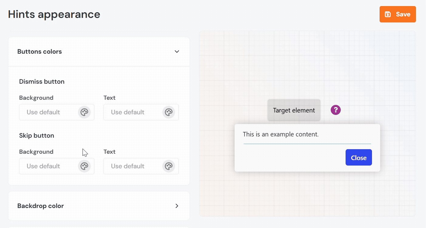
Buttons Colors
- Dismiss Button – Background: Sets the fill color for the "Dismiss forever" button, which removes the hint.
- Dismiss Button – Text: Sets the text color of the "Dismiss forever" button.
- Skip Button – Background: Sets the background color of the "Close" button.
- Skip Button – Text: Sets the text color of the "Close" button.
Note: The "Dismiss forever" button settings can only be previewed in the Product Fruits editor.
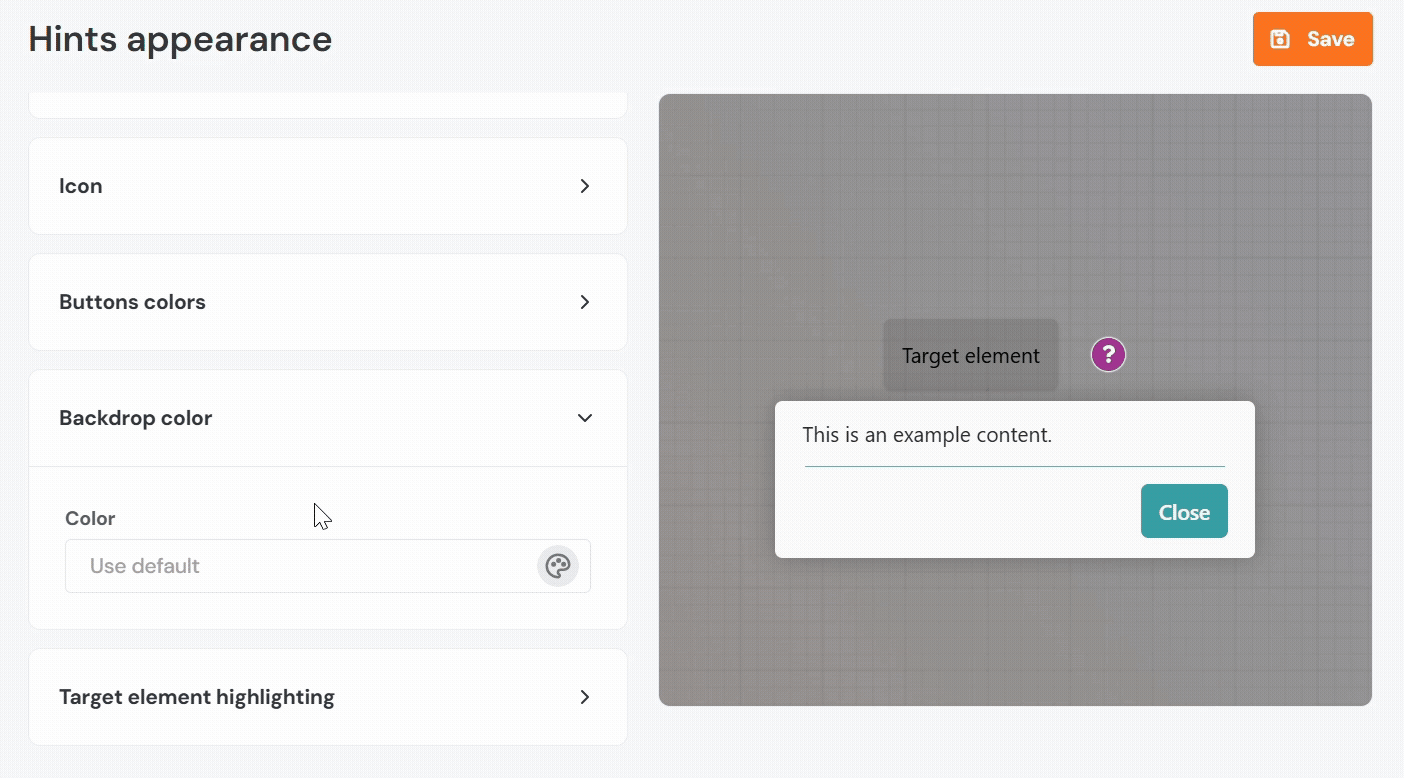
Backdrop
- Color: Defines the overlay color that appears behind the hint, if enabled.
 Tip: Lower the opacity to prevent the screen from being completely blocked, except for the hint.
Target Element Highlighting
- Box Color: Sets the color of the highlight box around the referenced UI element.
- Spacing from the Element: Determines the space, in pixels, between the element and the highlight box.
- Box Thickness: Sets the width of the border used for the highlight.
Note: It is only visible when the Backdrop is set to "Boxed" or "Overlay".
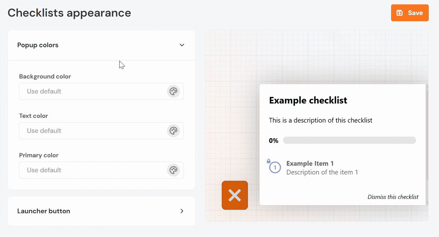
Checklists
Popup Colors
- Background Color: Sets the background color of the checklist panel that displays tasks.
- Text Color: Defines the color of all text within the checklist, including task names and descriptions.
- Primary Color: Applies to visual highlights, such as checkmarks, active steps, or progress bars.
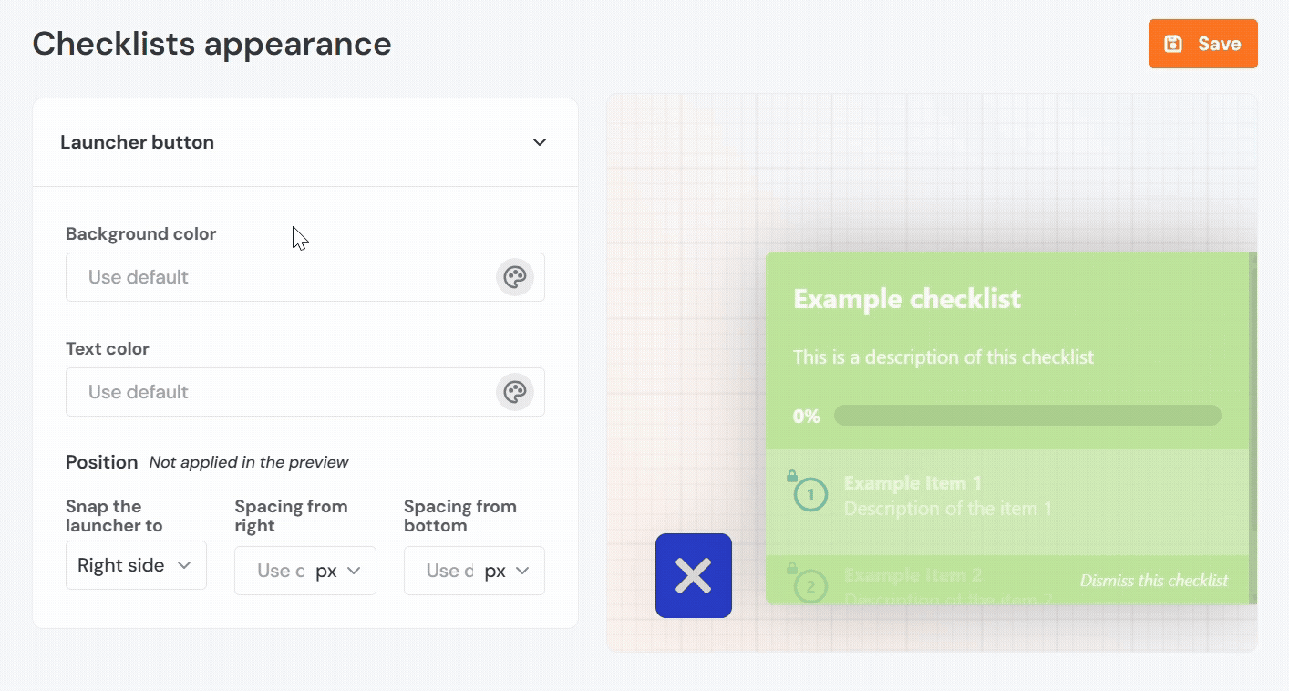
Launcher Button
- Background Color: Sets the background color of the floating launcher button that opens the checklist.
- Text Color: Sets the color of the icon or text inside the launcher button.
- Position:
- Snap the launcher to Left or Right: Specifies which side of the screen the launcher button appears on.
- Spacing from Left or Right: Defines the horizontal distance, in pixels, from the selected edge.
- Spacing from Bottom: Sets the vertical distance, in pixels, from the bottom of the screen.