Announcement Analytics
Announcements is an umbrella term that includes Pop-ups, Newsfeed, and Banners. All of these features use the same analytics structure, so once you learn how to access and read the data for one, you’ll know how to do it for the others.
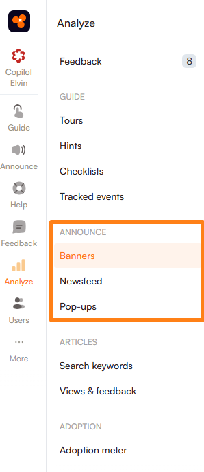
Getting Started
- Go to Analyze in the navigation menu.
- Under the Announce section, select the type of announcement (Pop-up, Newsfeed, or Banner) you want to view analytics for.
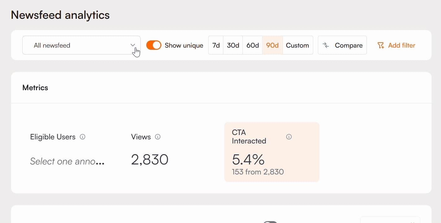
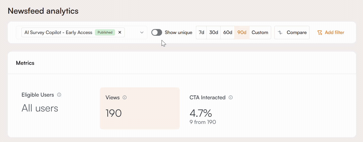
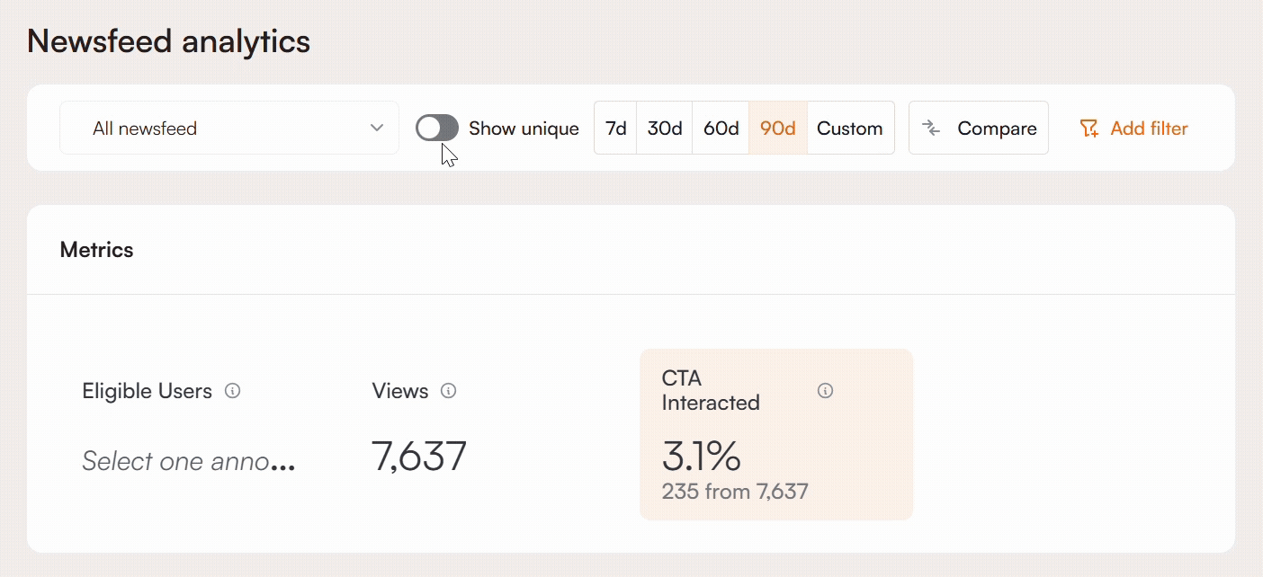
By default, the analytics page displays combined metrics for all items within the selected announcement type. If you want to focus on specific items, open the dropdown menu and select one or more announcements.
Published announcements are shown at the top. Use the search field to quickly find a specific one by typing its name. When you choose multiple, the data shown will be the sum of their combined metrics.
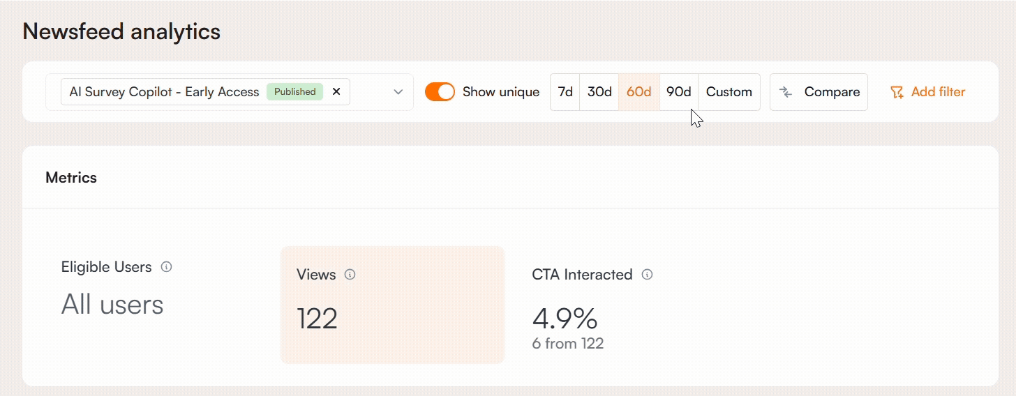
Show Unique vs Total
On the right side of the dropdown list, you’ll find the Show Unique toggle. When this toggle is off, the metrics display the total number of views and interactions, including multiple interactions from the same user.
If you want to see the total number of unique users who interacted with your announcement item, regardless of how many times they did so, simply turn the toggle on.
Set a Date Range
You can analyze your announcements over a specific period by selecting a date range. Use the preset options for quick selection, such as the last 7, 30, 60, or 90 days, or choose a custom range to specify exact start and end dates for more tailored analysis.
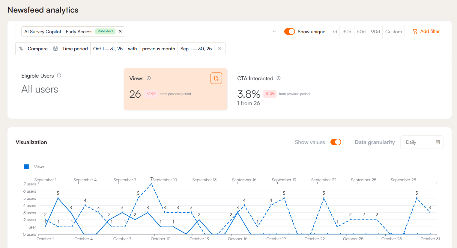
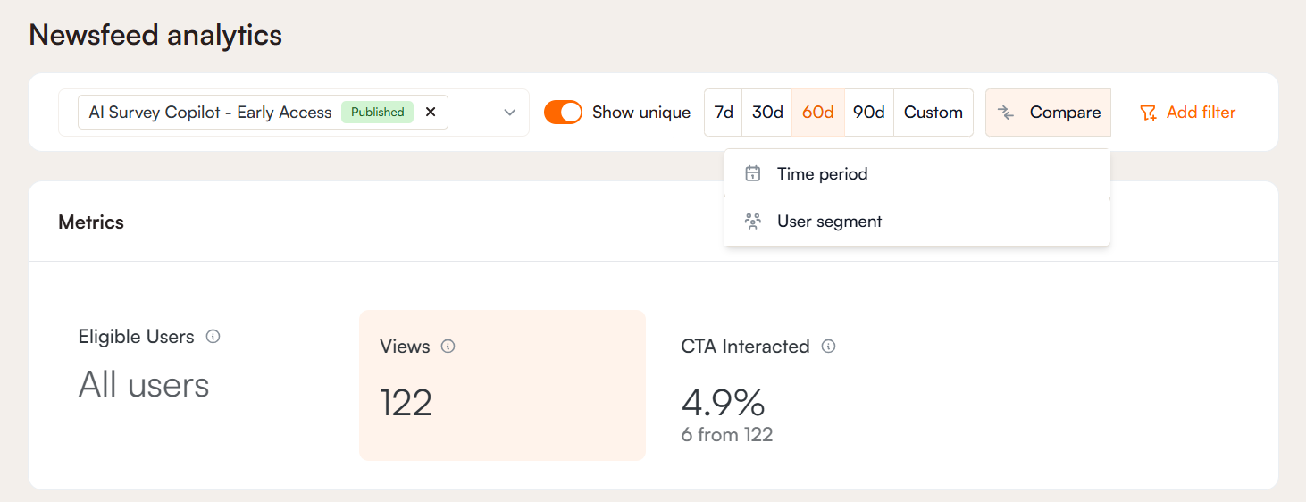
Compare
The comparison feature allows you to analyze performance from two perspectives:
- Time Range: This option lets you compare the announcement’s performance over two different time periods. For example, you can see how metrics from the past week stack up against the previous week, helping you understand trends and changes over time.
- User Segment: This option allows you to select two distinct groups of users and compare how each group interacted with the announcement item. This is useful for identifying differences in engagement or behavior between segments, such as new vs. returning users.

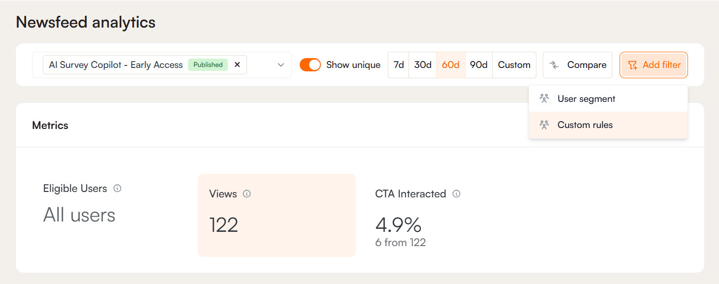
Filter
Filters help you narrow analytics by user segments or custom rules.
User Segment Filters: These let you analyze users in predefined segments, such as new or returning users. Segments reflect the user’s status at the time they interact with the tour. Check this article for details on creating segments.
Custom Rule Filters: With custom rules, you can filter users based on specific conditions from user data or inbound parameters. For example, you can filter by role, signup date, actions during a tour, or interactions with certain content. This allows you to see how different groups of users engage with your content and view detailed metrics for each group.
Metrics
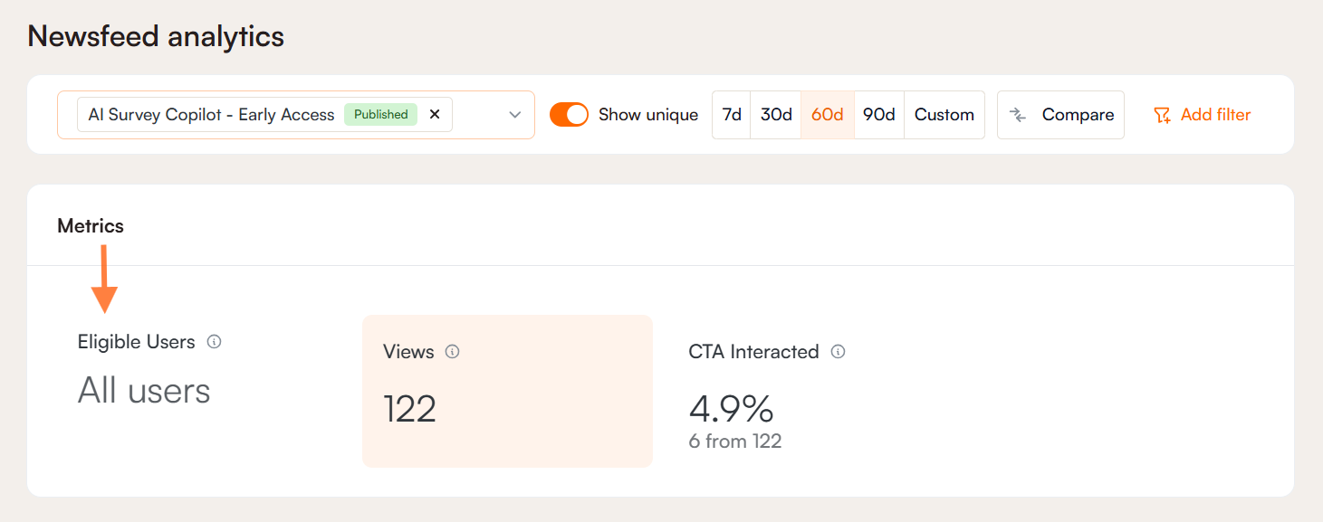
Eligible Users
This metric shows the total number of users who are able to see the announcement based on its predefined targeting and segmentation.
Note: This value is only displayed when a single announcement item is selected. If multiple announcements are selected, the metric is not shown because each announcement may have different targeting rules. In such cases, there is no straightforward way to calculate a meaningful total.
Views
The View section shows either total views or unique views for the selected time period, depending on your settings and whether the Show Unique toggle is on or off. It refers to the number of users who viewed and dismissed the announcement item without clicking the CTA.
By clicking the Export button in the upper-right corner, you can access and export a list of users who viewed the announcement.
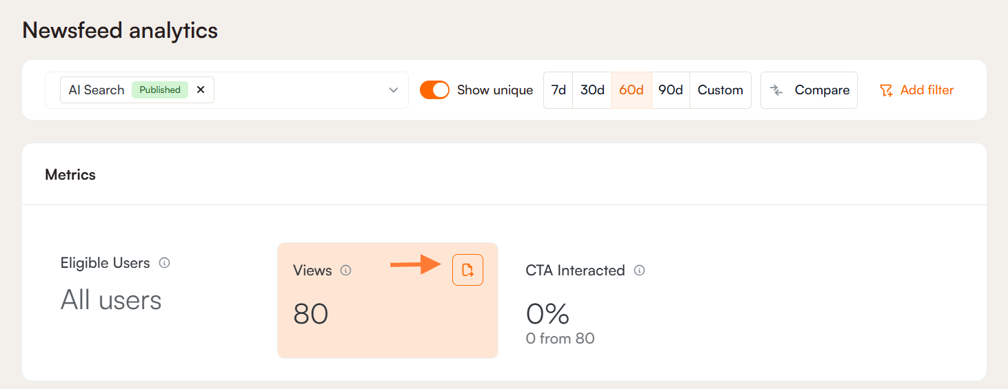
CTA Interacted
This metric shows the total number and percentage of users who interacted with the Call to Action (CTA) button, based on all users who were presented with it. Similar to Views, you can see both the total and unique number of users who interacted with it. You can also view and export the list of users by accessing the menu in the upper-right corner.
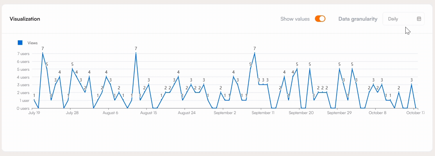
Visualization
The metrics from the previous section, including Views and CTA Interactions, can be visualized using a graph. To display the graph, simply click on the metric you want to examine. This allows you to quickly see trends and changes over time.
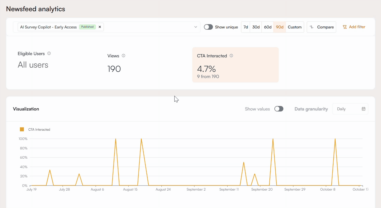
The Show Values toggle can be used to display either the number of viewers, if Views is selected, or the percentages directly on the graph. If CTA Interacted is selected, you can still view the number of viewers by hovering over a line, which will show the exact number of users or views at a specific point in time. This makes it easier to analyze detailed data within the graph.
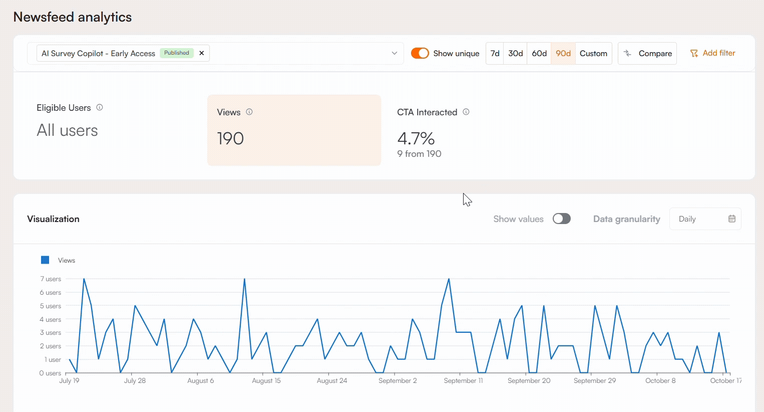
You can also adjust the data granularity to view metrics on a daily, weekly, monthly, quarterly, or yearly basis, depending on the level of detail you need.
If a comparison has been selected, the graph will display two lines to represent the items being compared. The dashed line corresponds to the second item in the comparison. When comparing data across time periods, the metrics from the earlier period will appear on top, providing a clear reference point for evaluating changes. Additionally, by hovering over a line, you can see the exact number of users or views for a specific point in time, making it easier to analyze detailed data within the graph.