
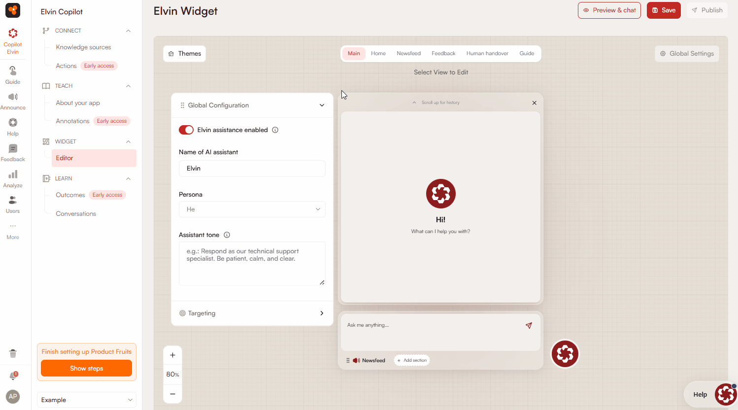
Elvin Widget Editor
Under the Elvin Widget section, you can configure various aspects of the Elvin Copilot and its widget. The configuration options cover the assistant’s behavior, appearance, and interactions with end-users from setting the tone of responses to enabling features such as the newsfeed or feedback widget.
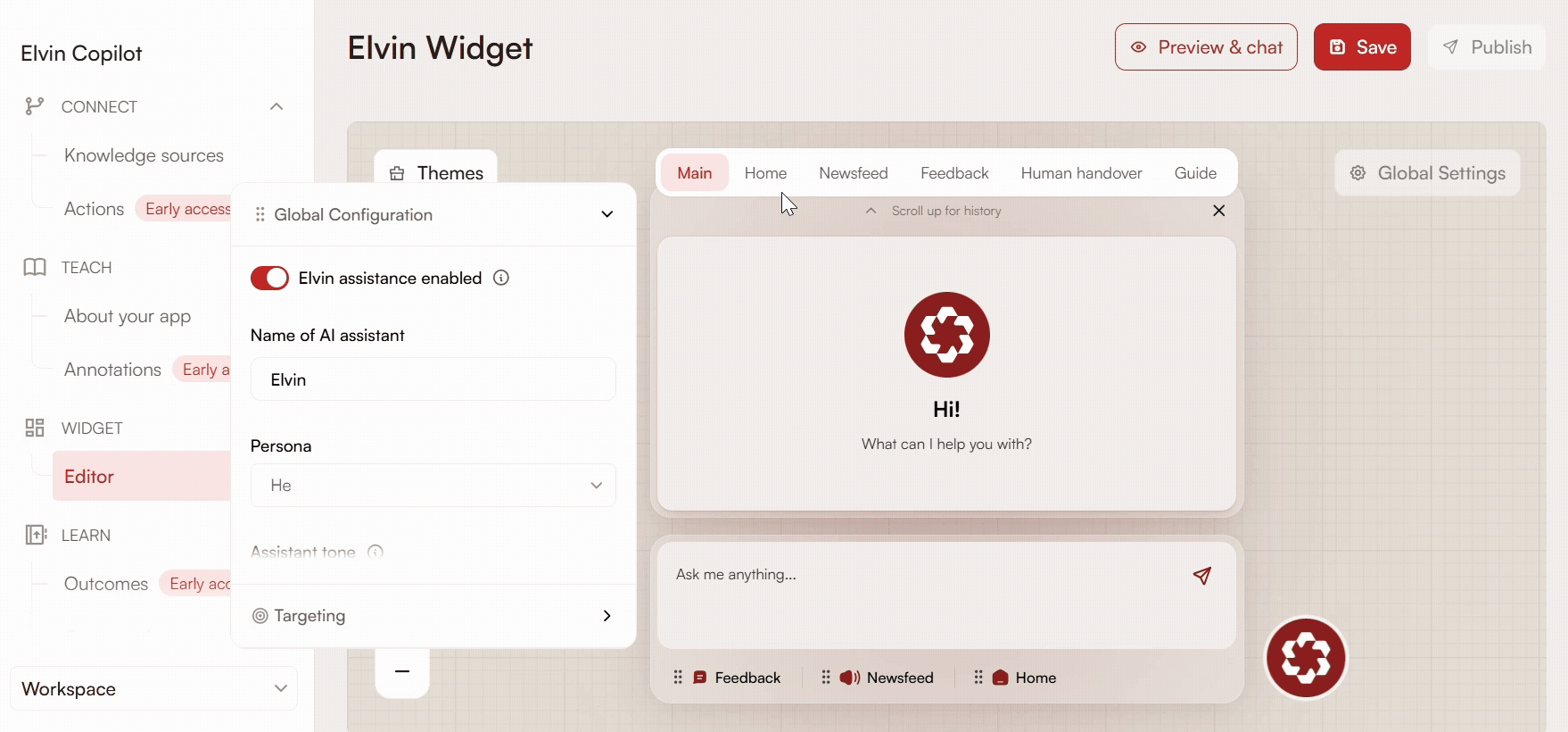
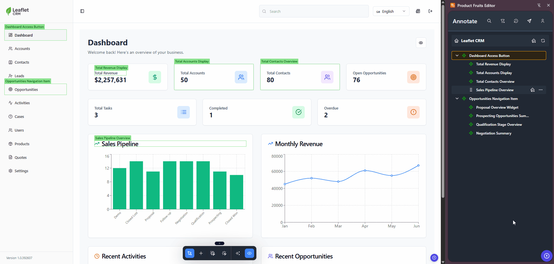
Accessing the Widget Editor
To begin configuration, navigate to Elvin Copilot → Widget → Editor.
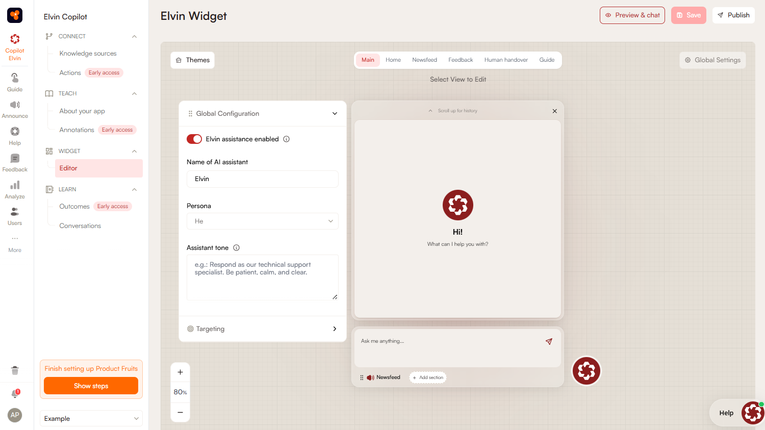
In the top navigation bar, you can see all the tabs you can configure:
- Main: Settings related to Elvin Copilot.
- Home: A customizable area where you can organize links, content groups, tours, videos, headers, and articles for quick access.
- Newsfeed: Displays elements added to the newsfeed.
- Feedback: Allows users to submit feedback.
- Human Handover: Can be configured as a separate tab or as a way for users to reach support from the Elvin Copilot chat.
- Guide: This tab is not visible to users. It can be used to configure personalized tours for your users.
The tab panel displays the currently selected tab, and you can view or modify its settings directly from there.
The input field, where users enter their questions, only appears when Elvin Copilot is enabled.
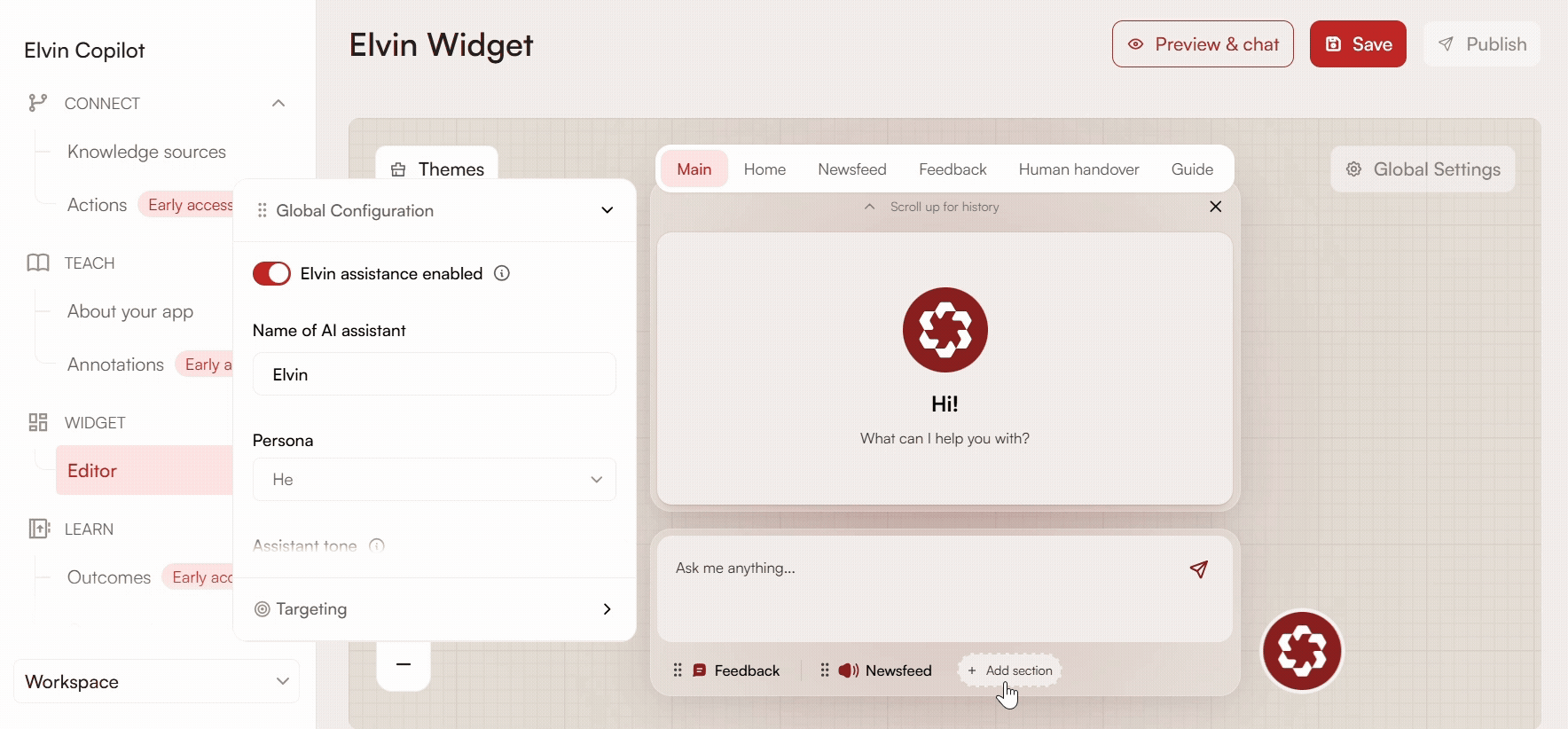
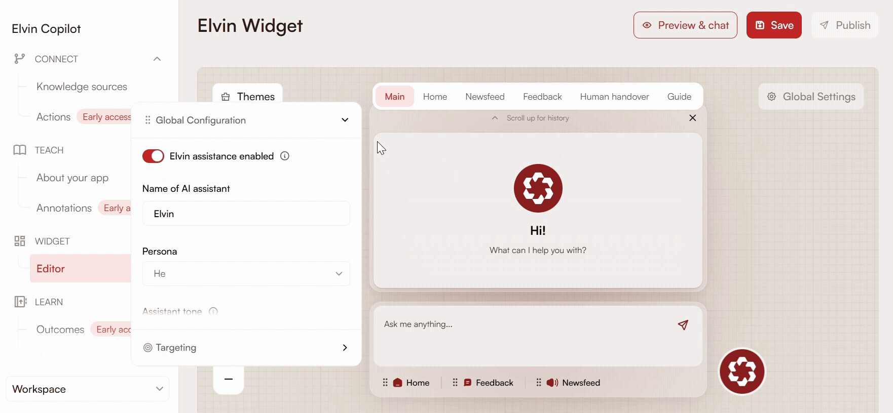
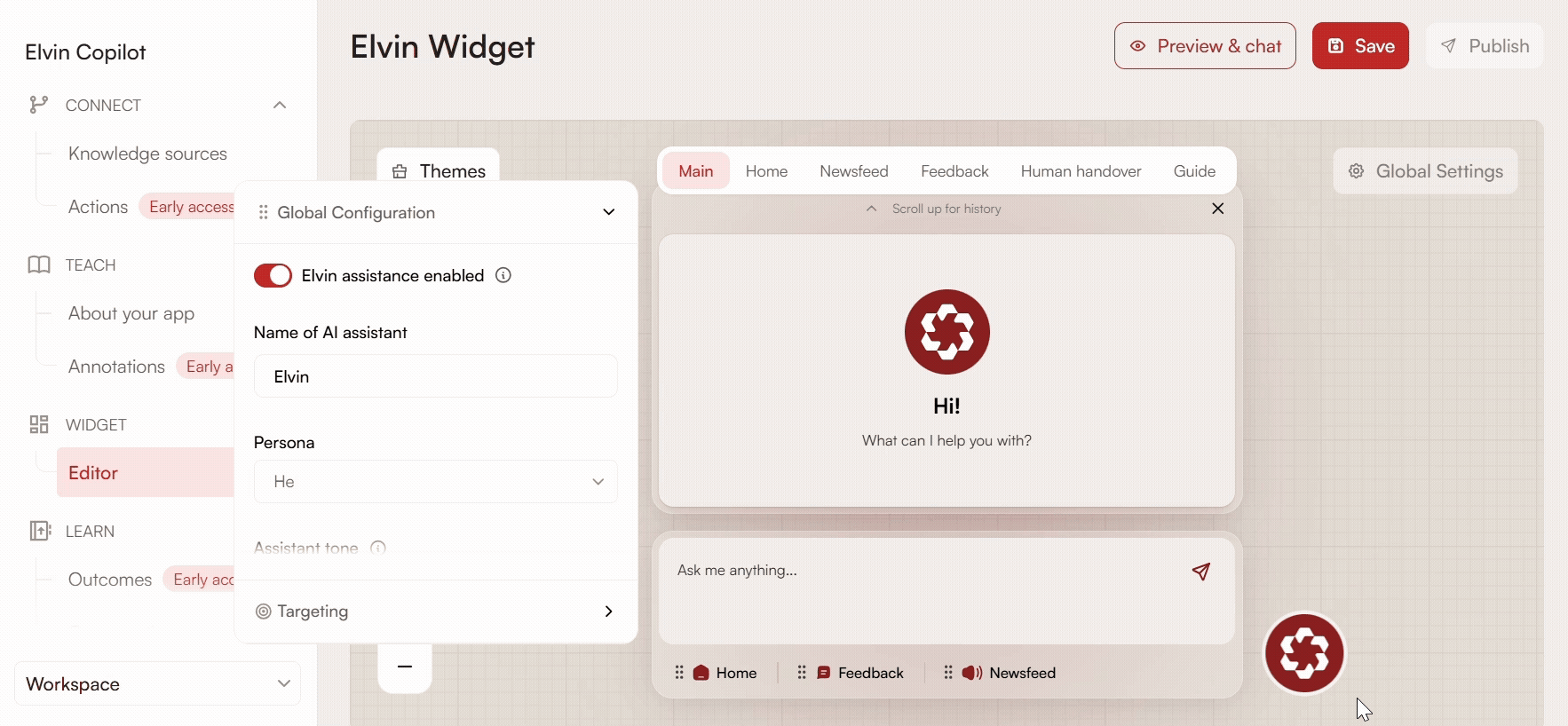
Below the input field, you can add and reorder sections to configure which tabs are visible in the widget and how they are arranged.
Settings dialog boxes can be moved around the screen, so they do not block the content you are working on.

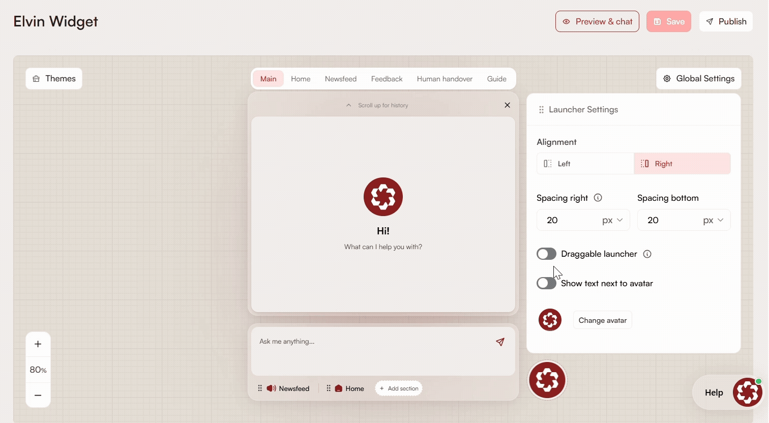
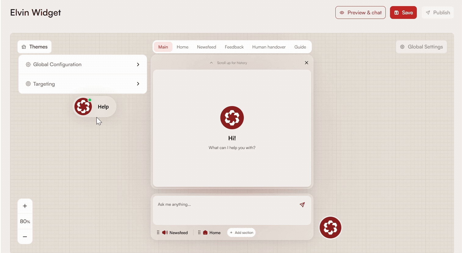
Launcher Settings
To configure the launcher, click the Launcher button in the editor to open the settings.
Alignment
Choose whether the launcher should appear on the left or right side at the bottom of your application.
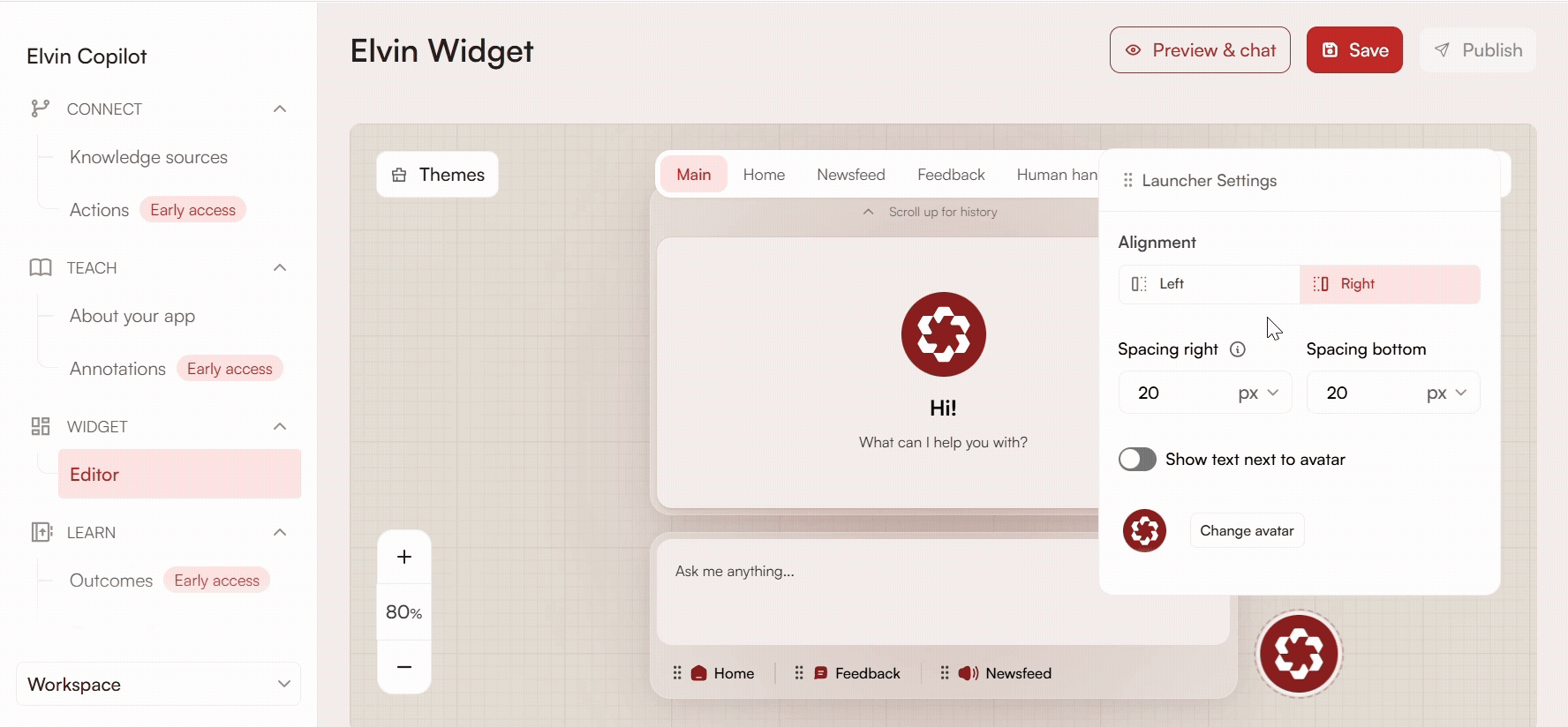
Spacing
Adjust the launcher’s position relative to the edges of the screen:
- Horizontal (Left or Right): Depending on the selected side, set the distance from the bottom-left or bottom-right corner. You can define this value in pixels or as a percentage.
- Bottom: Set how far the launcher appears from the bottom of the screen, in pixels or percentage.

Draggable Launcher
When the toggle is enabled, your users can drag and reposition the Elvin Launcher anywhere on the screen so it doesn't cover important parts of your application.
When the launcher is moved near the bottom-left or bottom-right corners, it will automatically snap and align to the default bottom position on release.
Notifications are always positioned relative to the launcher, wherever it sits on screen.
Regardless of where the launcher is placed, the widget panel always opens fully within the visible screen bounds with no overflow or clipping.
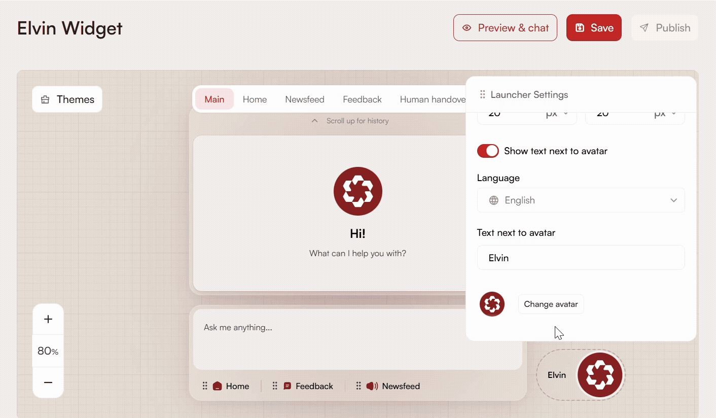
Show Text Next to Avatar
Enter the text to display next to the avatar. Keep it short for clarity. You can also select the language, which depends on the localization settings of your application in Product Fruits.
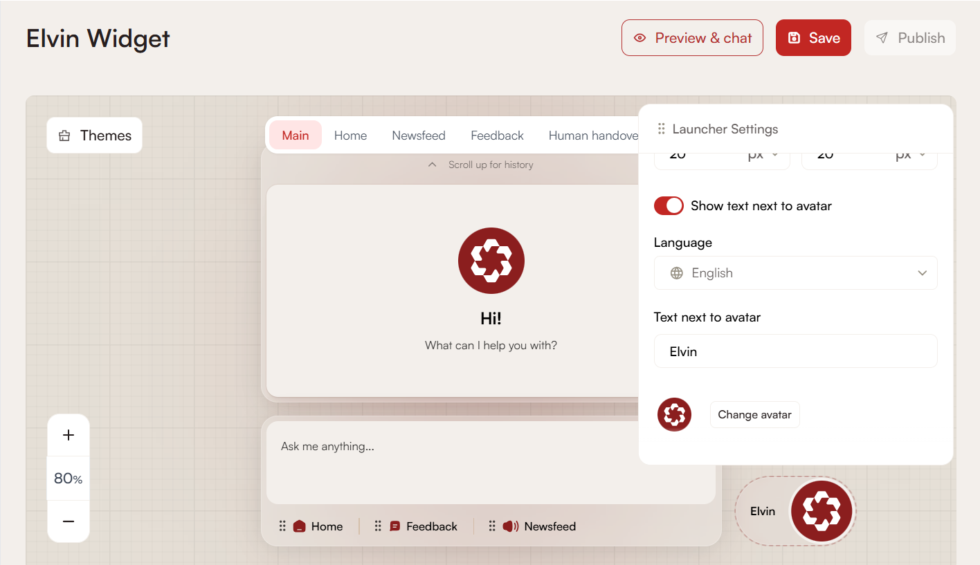
Change Avatar
You can upload your own avatar or pick one of the predefined options. Don’t forget to scroll down and save your changes. The new avatar will replace both the launcher icon and the avatar that appears in the Copilot chat when users open it. The maximum file size is 5MB.
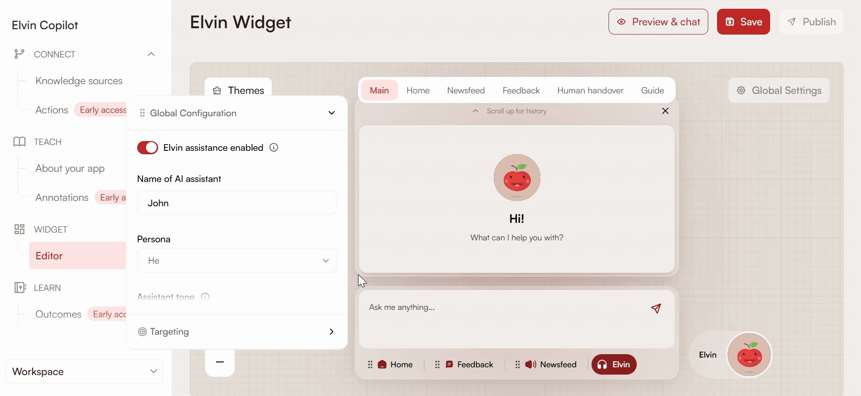
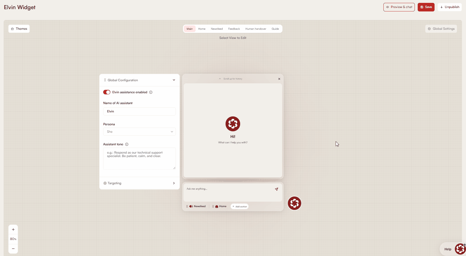
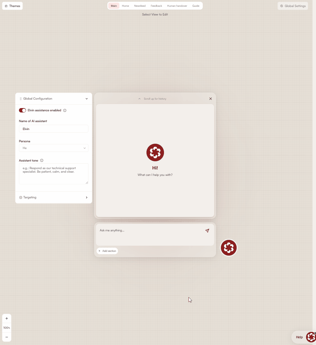
Elvin Copilot Configuration
In Global Settings/Configuration, you can enable or disable Elvin Copilot for your users by toggling it on or off. By default, Elvin Copilot is the first tab, but if the Home tab is set as default, Copilot will show as a separate section with a renamable button.
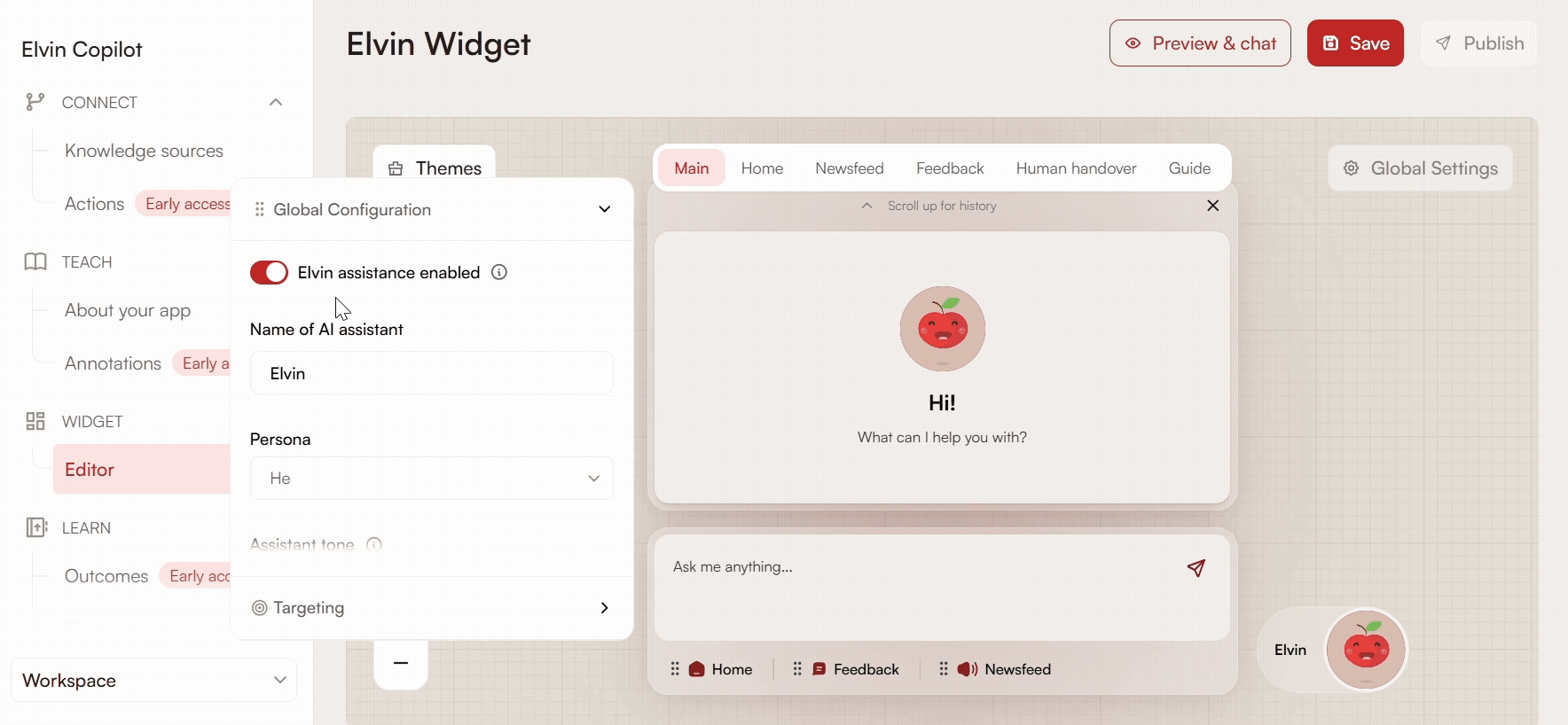
Name of the AI Assistant
Set the name that will appear next to the Elvin Copilot icon when users chat with it.
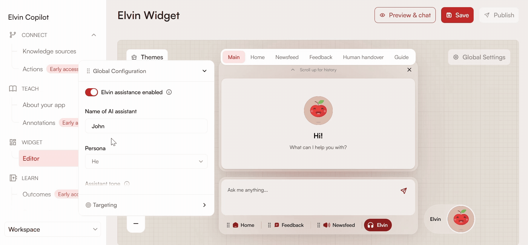
Persona
Choose the assistant’s persona: he or she, to give the assistant a more human presence for users.
Assistant Tone
Be short and specific when defining how your assistant responds to users (e.g., formal, very friendly, concise). This section is meant for general guidance on the assistant’s tone. Avoid providing long or detailed instructions. Do not use it to specify exact responses to user questions.
Placeholder Text
Set the default text displayed in the input field before users start typing. Click the body area of the lower box to edit it.
Home
The Home tab lets you organize and present key content, actions, and resources to your users in one central place. You can structure it using headers, groups, and a variety of interactive items to make it easy for users to find information or take action.
Go to a Link
- Title: You can change the default title (for example, from “Visit our website”).
- Description: Add a short description so users understand where the link leads and why they should click it.
- URL: Provide the destination URL. Make sure to include
https://for external links; otherwise, the link opens within your application. - Open in new tab: Toggle this option to open the link in a new browser tab.
Group of Items
Use this option to group multiple items under a single expandable section. Open the group and select which items you want to include. You can choose whether the group is collapsed by default or stays open by enabling Always expanded.
Launch a Tour
Add a button that launches one of your existing tours. Select the tour you want to trigger when users click the item.
Open a Video in a Pop-up
Provide a video URL to display the video in a pop-up window. Only YouTube, Vimeo, and Loom links are supported. You can choose whether to show the video thumbnail before playback.
Header
Add a header to visually separate and organize sections within the Home tab. Headers help structure content and make it easier for users to scan.
Open an Article
Select an existing article from your Product Fruits knowledge base to display when users click the item. This allows you to surface relevant documentation or help content directly in the Home tab.
Newsfeed
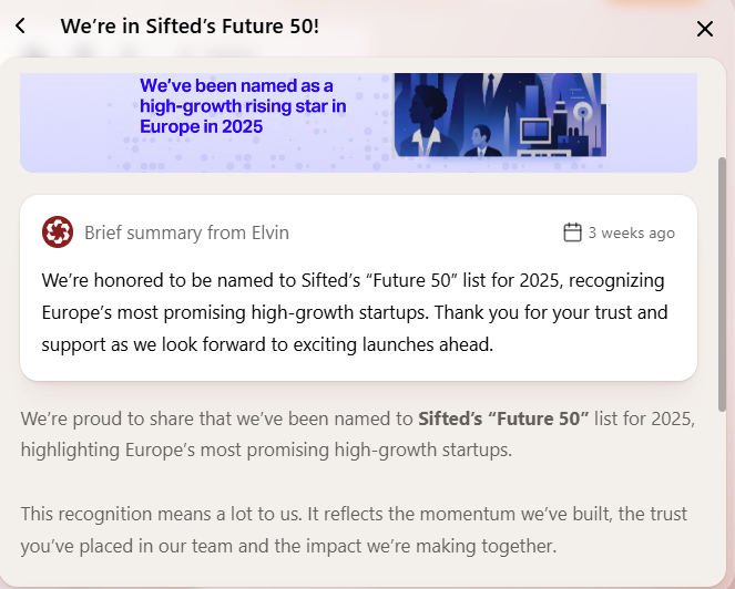
This tab displays newsfeed items created under Announce > Newsfeed. To learn how to create a newsfeed item, follow this link.
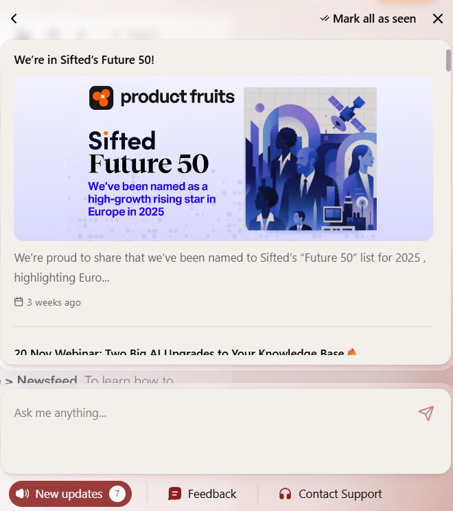
When a user opens a news item, it expands and Elvin generates a brief summary of the content.
Feedback
If you already have a standalone feedback widget published, you can migrate it here and continue using it without starting from scratch.
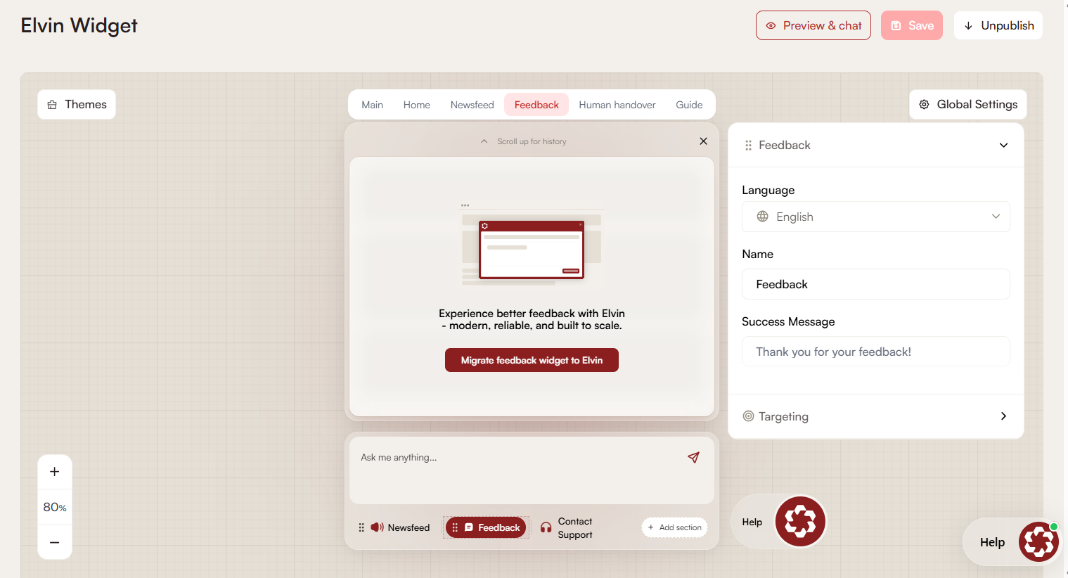
If you are just getting started, you can configure how users submit feedback and how it reaches your team using the options below.
Notifications
Configure how feedback is delivered to you. Multiple notification methods can be enabled.
Slack
Connect your Slack workspace to receive feedback in a selected channel.

Send feedback to a specified email address.
- Set feedback as solved: Marks feedback as solved after notification, if enabled.
- Use unique sender email: Sends each feedback email from a unique sender address, improving threading and filtering.
- Email subject: Custom subject line for feedback emails.
Webhooks
Send feedback to your own system using a webhook.
- URL – Endpoint that receives the feedback data.
- Method – HTTP method used to send the data:
- POST – Sends feedback as a new payload (commonly used for new entries).
- PUT – Updates an existing resource with feedback data.
- GET – Sends feedback as URL parameters; suitable for simple integrations.
- Set feedback as solved on success – Automatically marks feedback as solved when a successful response is received.
Analytics
You can view all the feedback submitted here in Analytics > Feeback.
This includes feedback submitted from the editor, even if the feedback widget is not published or visible to users.
All submitted feedback is included in Elvin outcomes and contributes to analysis and reporting.
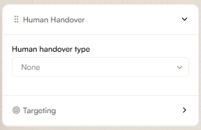
Human Handover
Elvin Copilot is used as the first layer of support. Human handover allows users to contact your support team when Elvin cannot help.
None
When this option is selected, users cannot contact human support.
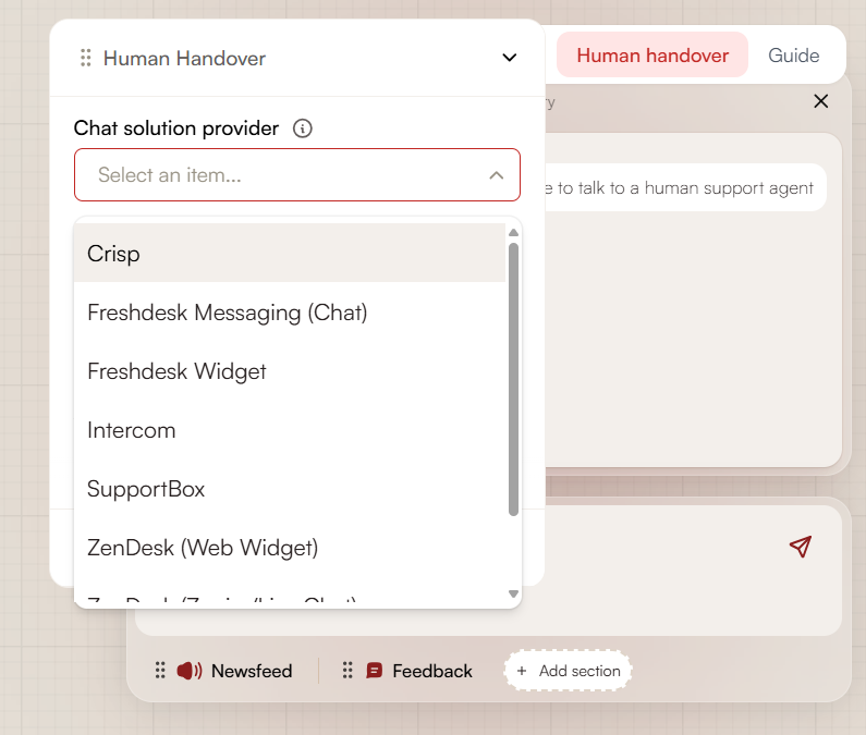
Chat Provider
This option lets users contact support through a third-party chat provider.
You can configure the support button text shown in the chat. You must also select a supported chat solution provider from the list of available integrations.
The support button display time controls how long the button remains visible to users in the chat.
To learn how to set up and integrate a third-party chat provider, click here.
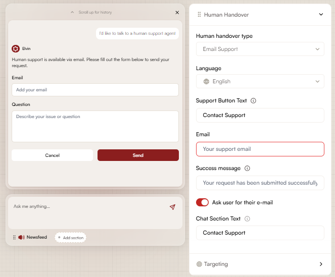
This option allows users to contact support by email.
You can configure the support button text and provide the email address users should contact. After a message is sent, a success message is shown to the user.
When the “Ask user for their email” option is enabled, users are required to provide their email address before submitting their message.
Feedback Widget
This option routes users to the Feedback widget. The widget must be configured in the Feedback section.
When conversation summary is enabled, a summary of the Elvin conversation is included with the feedback.
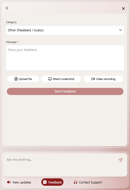
Custom Fields
Add fields to the Feedback tab.
Available field types:
- Single-line input – Text field for short values.
- Select (dropdown) – Single-choice field with predefined options.
- Multi-select – Field that allows selecting multiple options.
Each field includes the following settings:
- Label – Text shown above the field.
- Placeholder – Text shown inside the field.
- Required – When enabled, the field must be completed before submission.
- Options – List of selectable values (Select and Multi-select only).
Guide
When the Allow Elvin to generate guide toggle is enabled, Elvin automatically creates personalized in-app guides for each user. These guides are based on user interactions and help them navigate or complete tasks within your app.
To use this feature, your app must first be annotated so Elvin can understand its structure and content. Click here to learn how to annotate your app and enable guide generation.
Preview and Chat
Even in the preview, you can test and have a conversation to see how Elvin responds and how the widget looks and behaves.
Keep in mind that this preview is intended for testing tone and interaction. It is not recommended for testing the accuracy of sources.
Appearance and Color Settings
In the upper left corner of the editor there is a button for Themes, where administrators can select either the default theme for Elvin, or select from several predefined color schemes. Additionally, administrators can fully customize colors for the primary color, background, surface, and text. These can be adjusted using a color picker or by entering specific hex codes. When custom colors are defined, the remaining colors are automatically recalculated to maintain a visually harmonious design. Administrators can also upload a custom avatar for Elvin to match the client’s branding.
 Need more help? Book an Elvin Demo with our team of AI experts.