Tour Editor Part 2: Basic Settings
This article will cover the Basic Settings section of the editor, illustrating how you can make your tours more eye-catching using presentation settings and visual effects.
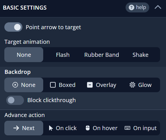
At the top of the basic settings, the Point arrow to target toggle enables you to attach a pointer arrow from a card to its designated element. The arrow's position is automatically determined, enhancing your target's visual distinction.
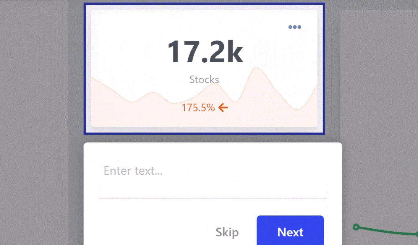
Target Animation
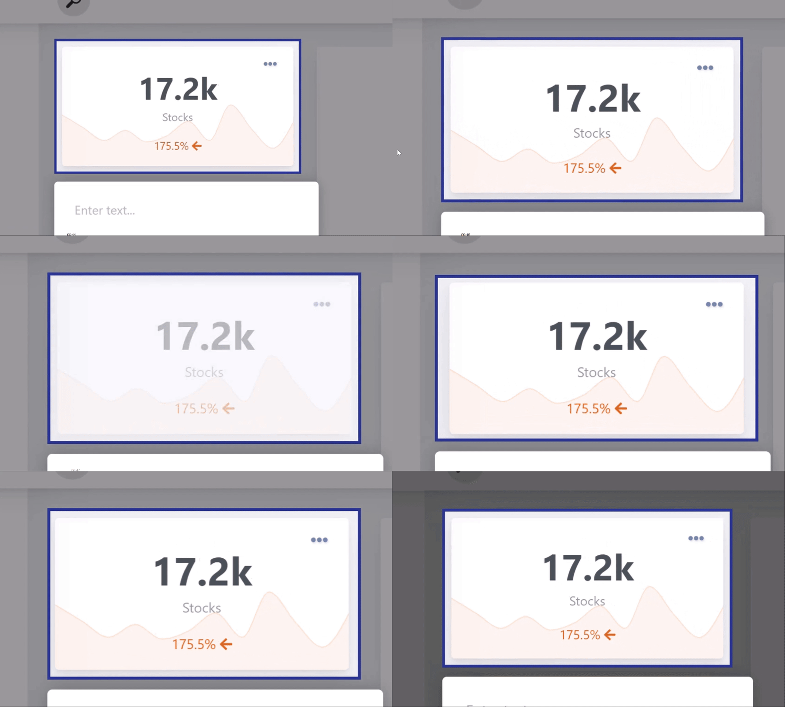
Next, you'll find the Target animation settings. While the default is set to None, you have the option to choose from three additional animations—Flash, Rubber Band, and Shake—that bring unique motion to your cards. In the GIF below, you can see these effects demonstrated in the same order.
Backdrop
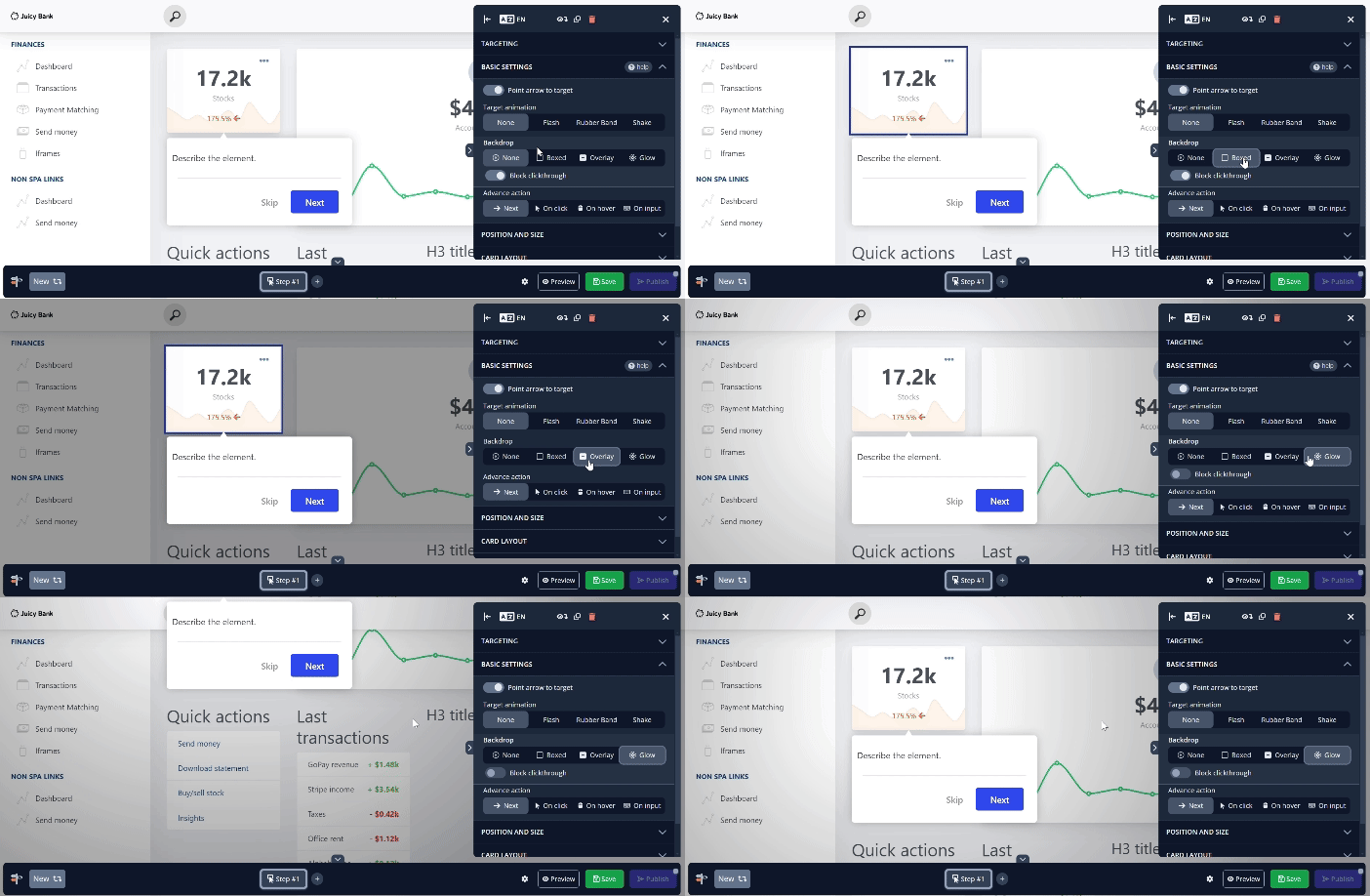
Next is Backdrop, which defaults to Overlay. With Overlay, the background around the targeted element is darkened, and a thin border highlights the target for added emphasis. Selecting None removes any visual indication of the target, displaying the tour card without enhancements. This option is ideal for using the pointer arrow mentioned earlier. The Boxed setting retains the border seen in Overlay but removes the darkened background, while Glow gradually darkens areas farther from the target, creating a spotlight effect to focus the user's attention.
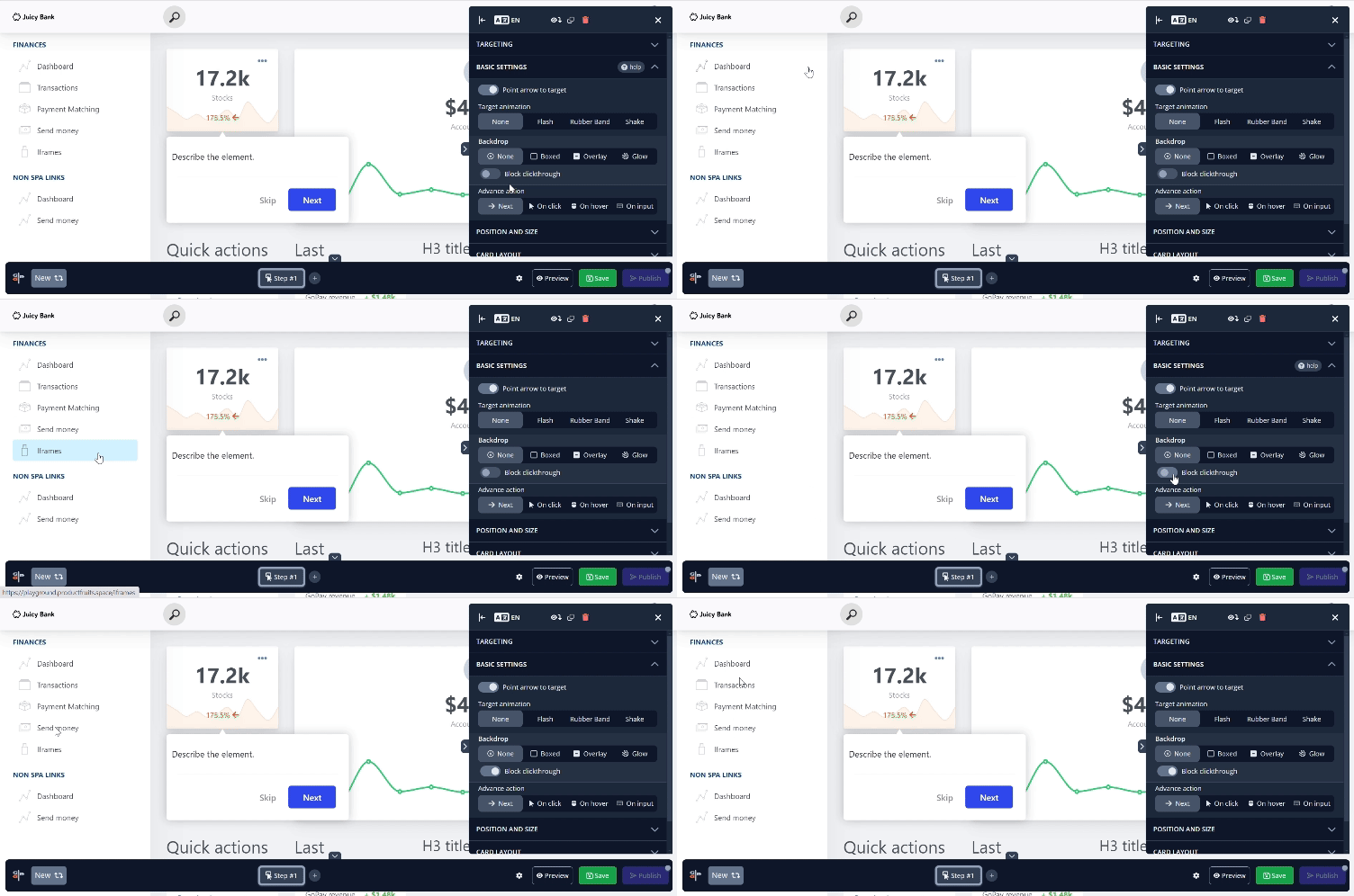
Block Clickthrough
You might notice that, aside from the Overlay setting, each option includes a Block clickthrough feature. This setting stops users from clicking or interacting with anything on the webpage outside of the tour card. When Block clickthrough is turned off, elements on the page are still clickable. But once it’s switched back on, those options are no longer accessible.
Advance Action
The final part of Basic Settings is the Advance Action option, which defaults to advancing the tour by clicking the Next button. However, there are times when you might want the tour to progress when the target is clicked, such as with links that navigate to a new page or other interactive features.
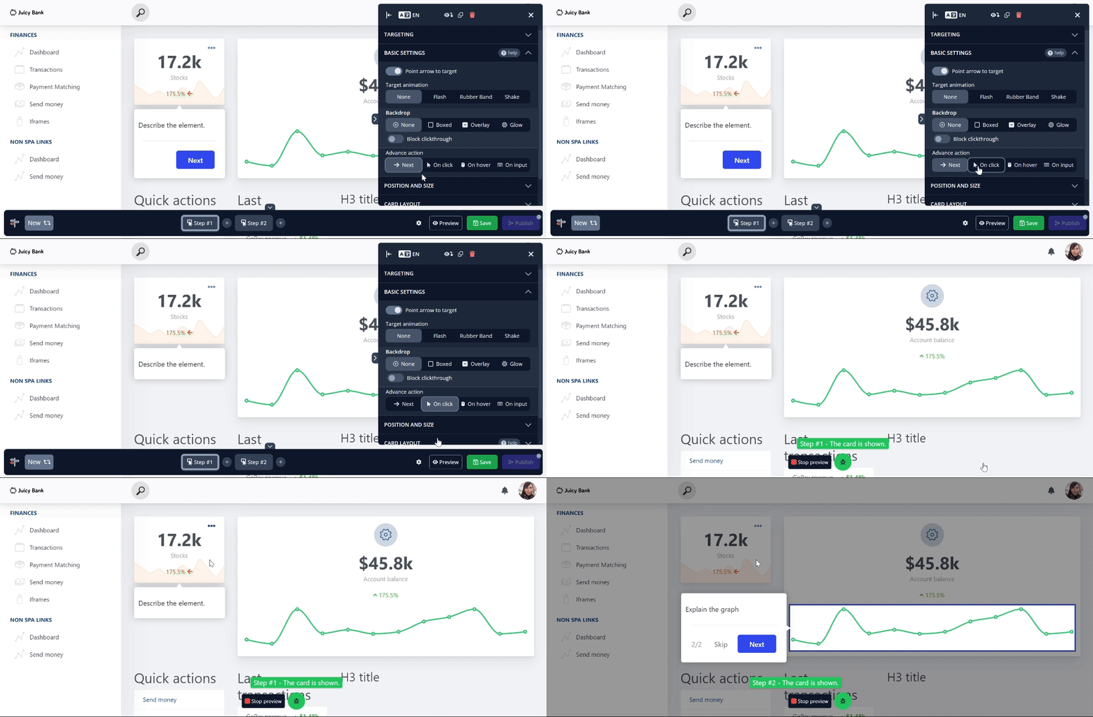
Notice how the Skip button was previously hidden. You will learn how to do that in a later article.
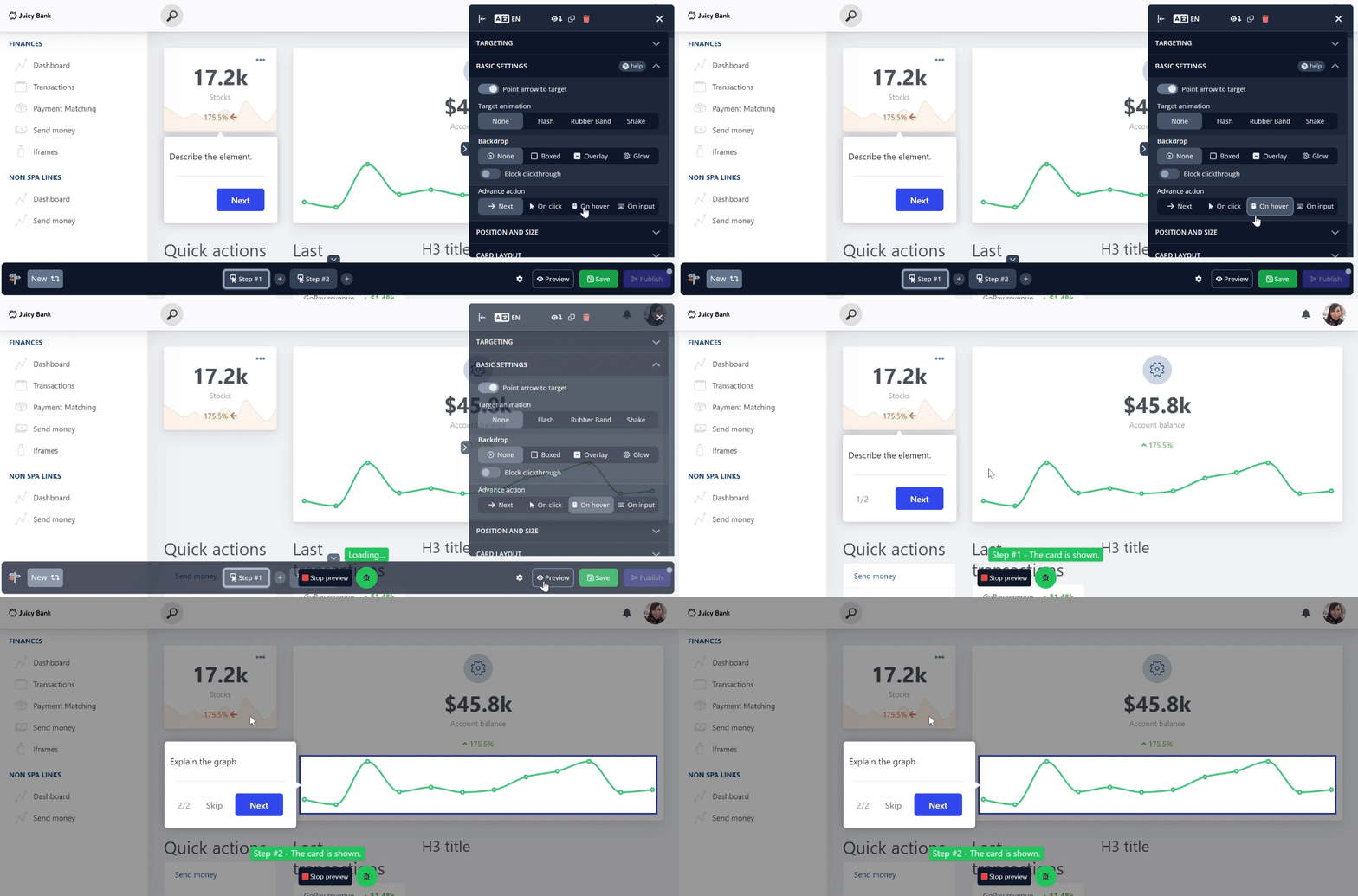
You can also set the tour to proceed when the target element is hovered over.
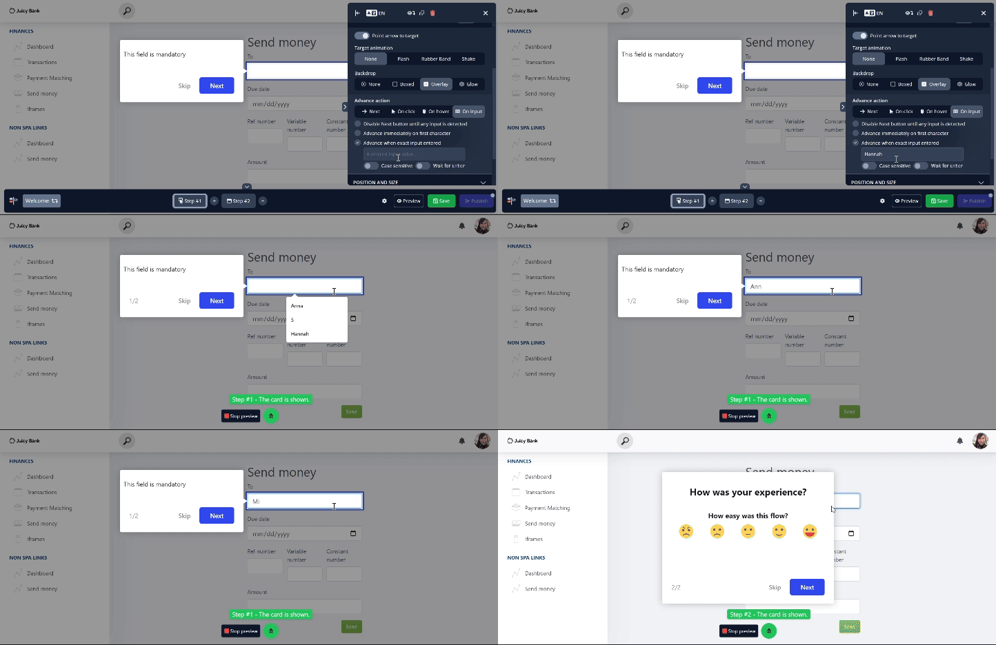
The last choice, On input, opens a hidden menu that may look scary initially, but each feature inside is fairly straightforward. The first option, Disable Next button until any input is detected, functions as its name suggests. Users cannot advance to the next card until they enter any input. You can also specify a minimum character count that must be reached before they can proceed.

The next option is Advance immediately on first character. The key distinction between this and the previous option is that instead of activating the Next button, the tour progresses as soon as a key is pressed. Similar to before, it doesn’t matter what the user types; as long as any key is pressed on the keyboard, the tour will continue.
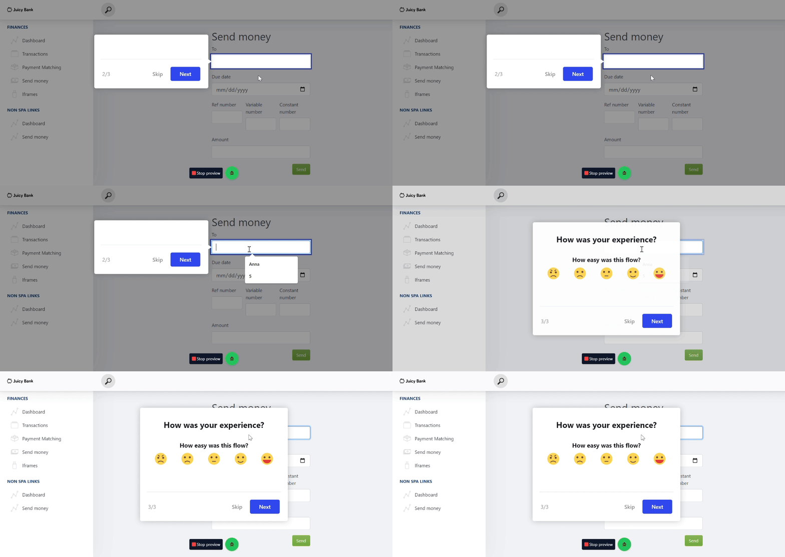
The final option enables you to specify an exact combination of characters that the user must enter to advance. Additionally, you can set extra conditions, such as making the input case-sensitive and requiring the Enter key to be pressed before proceeding.
Adding Videos to Tours
1. Add a Video When Creating or Editing a Card
- When you open the editor or create a new card, you will see several templates.
- Select the Video Explainer template.
- This template contains a placeholder video. Click the Settings icon in the top-right corner of the video.
- Replace the placeholder link with your desired video URL.
- Click Update Video to save your changes.
2. Add a Video to an Existing Tour Card
- Hover over the section of the card where you want the video to appear.
- On the right side, click the three dots (More) button on the yellow background.
- Choose the Video option.
- Enter the video URL you want to use.
- Click Insert Video to add it to the card.
