
Customize Life Ring Button
Change icon
To customize the launcher icon, navigate to the Appearance tab. From there, you can select one of the preset icons provided.
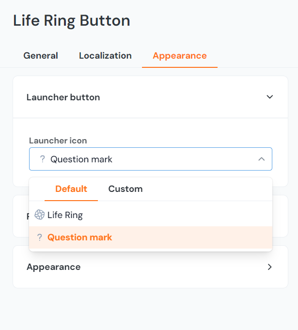
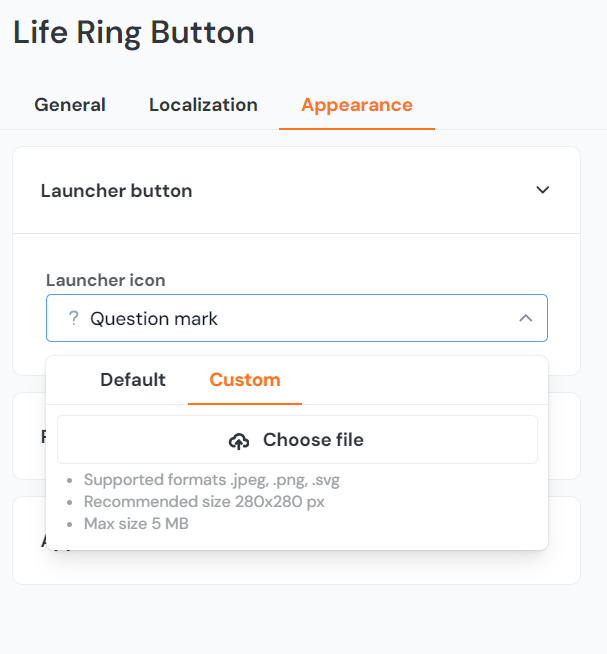
Alternatively, you may upload a custom image of your own that fits the required size and specifications.
Change the size of the launcher
.button-launcher {
transform: scale(0.6);
}
Notes
- The built-in icon in the button should adjust itself
- If you also use text, it might overlap with smaller launcher button sizes. To correct this, use a larger size or change the font size with
font-sizeCSS property.
Change the position of the launcher
From the bottom-right corner (default)
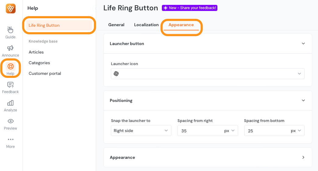
The first option is to use the settings in the Life Ring Button Appearance tab which can be found by clicking on the Knowledge base icon on the lefthand side menu then navigating to the Appearance tab. This will offset the position by the X or Y axis.
The second option is to use Custom CSS. In this case, do not use the Design position fields shown above.
.productfruits--lifering {
    right: 200px;
    bottom: 200px;
}
From bottom-left or other corners
This option allow you to unset the right and bottom CSS properties first and then set the position.
.productfruits--lifering {
    right: unset;
    bottom: unset;
    top: 200px;
    left: 200px;
}
Removing the img at the top left of the modal
This will get rid of the secondary image of a lifesaver.
.productfruits--lifering-modal-title::before {
visibility: hidden !important;
}
Change the drag-handle
If your Life Ring Button is enabled to be moved by users manually on the screen, you might want to adjust the design of the drag handle which is displayed on mouse hover. Use the following snippet:
/* For the handle container */
.pf-life-ring-launcher-move {
	backgroud-color: red;
}

/* For the handle icon */
.pf-life-ring-launcher-move::after {
	background-image: url(.....)
}