Life Ring Button Overview
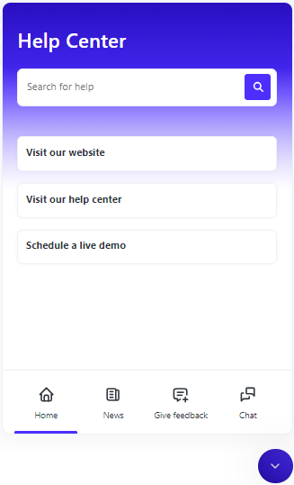
The Life Ring Button is an in-app help center accessible which can be accessed from every page of your application, or only select pages based on your configuration. It contains tabs with different content. These tabs are configurable; you can customize them to suit your needs or you can just use the selected ones. All of this can be done without coding.
Home Tab
This is the main tab and the only tab that cannot be turned off. You can add various types of items:
- Tours - this type launches a particular tour. The tour can be relaunched by users.
- Links - will open any given URL.
- Video pop-up - YouTube, Vimeo, or Loom video links are supported. The video item can display its thumbnail and it will be opened in a dedicated pop-up. If your videos are hosted on internal or other services, you can link them using the "Link" element described above.
- Article - this item will display a selected article. The article will be displayed directly in the Life Ring Button, users won't leave your application. The size of the Life Ring Button will adjust according to the content to enhance reading comfort.
- Group of items - this item holds other items. Users can expand it or the group can be set to be auto-expanded, then all sub-items are still visible.
Check the quick overview of all items in action:
News Tab
When this tab is enabled, it will display news from our Newsfeed feature. The button can also be configured to display a badge with a count of unread news. You will find this setting in the Knowledge base-> Life Ring Button -> General settings tab -> Launcher badge -> set to “A number of unread newsfeed items”.
Give Feedback Tab
This tab opens our Feedback widget, which enables users to send screenshots or videos along with a written note describing the problem. The collected feedback can be found in the Inbox, located here.
Chat tab
This tab allows you to integrate third-party chat tools. After integration, this tab will open the chat tool. Read more here.
Search
The search bar is consistently visible in the Life Ring Button, allowing users to conduct full-text searches through Knowledge Base articles. This feature offers easy and quick access to knowledge and support articles. These can be read directly within the Life Ring Button, meaning users do not need to leave the webpage they are currently viewing.
Settings
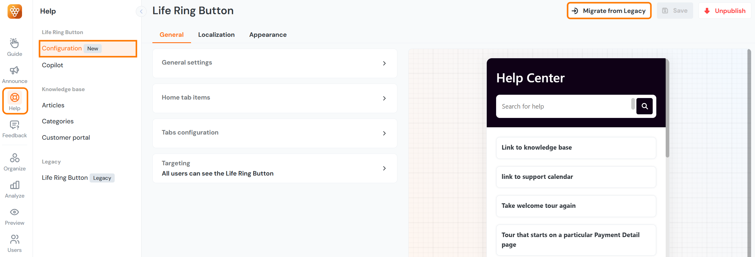
You can access the settings for the Life Ring Button through Knowledge base -> Life Ring Button.
General
General settings
- Draggable by users (toggle) - If switched on, users can manipulate and reposition the Life Ring Anchor (The life ring icon) on the screen.
Home tab items
- This section allows you to create content for the Home tab. There are five possible item types:
- Group of items - You can group multiple items under one category.
- Launch a tour - after clicking on this item a selected tour will be launched for give user
- Go to a link - user is after click forwarded to specified URL
- Open a video in a popup - opens a linked video (which must be stored in the cloud) in a pop-up window in the browser.
- Open an article - opens an article created in the Product Fruits Knowledge Base (learn more)
Localization
- Launcher text - this option lets you add text to the main launcher icon where users can display the Life Ring. You can enter your text or leave the field empty if you want to maintain just an icon without text.
- Tabs localization - each tab can be named and localized for each supported language. It's also possible to localize placeholder texts.
Appearance
- Positioning - in this section, you can adjust the position of the Life Ring Button component through the provided settings on the webpage.
- Appearance - this section allows you to set the font, color, and theme for the entire component and its parts.
Migration from the Legacy Button
If you're currently using the Legacy Button it's important to know that newer features, like the AI Copilot are not compatible with the older version of the Life Ring Button. But don't worry, migrating to the new version is simple, just follow these steps:
- Navigate to the Knowledge base menu, and under the Life Ring Button section, click on Configuration (New).
- In the top-right corner, you'll see the Migrate from Legacy option, click it to continue.
- After migration, check the new Life Ring Button to ensure all items have been migrated and it is styled correctly. If necessary, adjust custom CSS styles and other settings to suit your needs.
- Once ready, unpublish the old Life Ring Button and then publish the new one.
What to Expect During and After Migration:
- All items from the Home tab, URL filter, and draggable toggle settings will be automatically migrated.
- Custom CSS adjustments will not be migrated.
- The new version of Life Ring does not support headers. Please refer to the chapter below for more information.
- The new Life Ring Button will not be automatically published after migration; it must be published manually.
- After migration, the old Life Ring Button will remain available and its state will be preserved. For example, if it's marked as "Published", it will stay "Published".
- After the migration, the original Newsfeed will not only be preserved but also integrated and displayed in the new Life Ring Button in tab “News”.
- If you're using a custom launcher for the old life ring button, the old life ring button will continue to be launched from this launcher. You can see how to update your custom launcher to launch the new life ring button here.
- If you've set up a custom chat integration, you will need to update the API calls being used to open the new button instead of the old one. They can be found here.
Please note that you can repeat the migration process. However, each migration will replace the previous version of the new Life Ring Button.