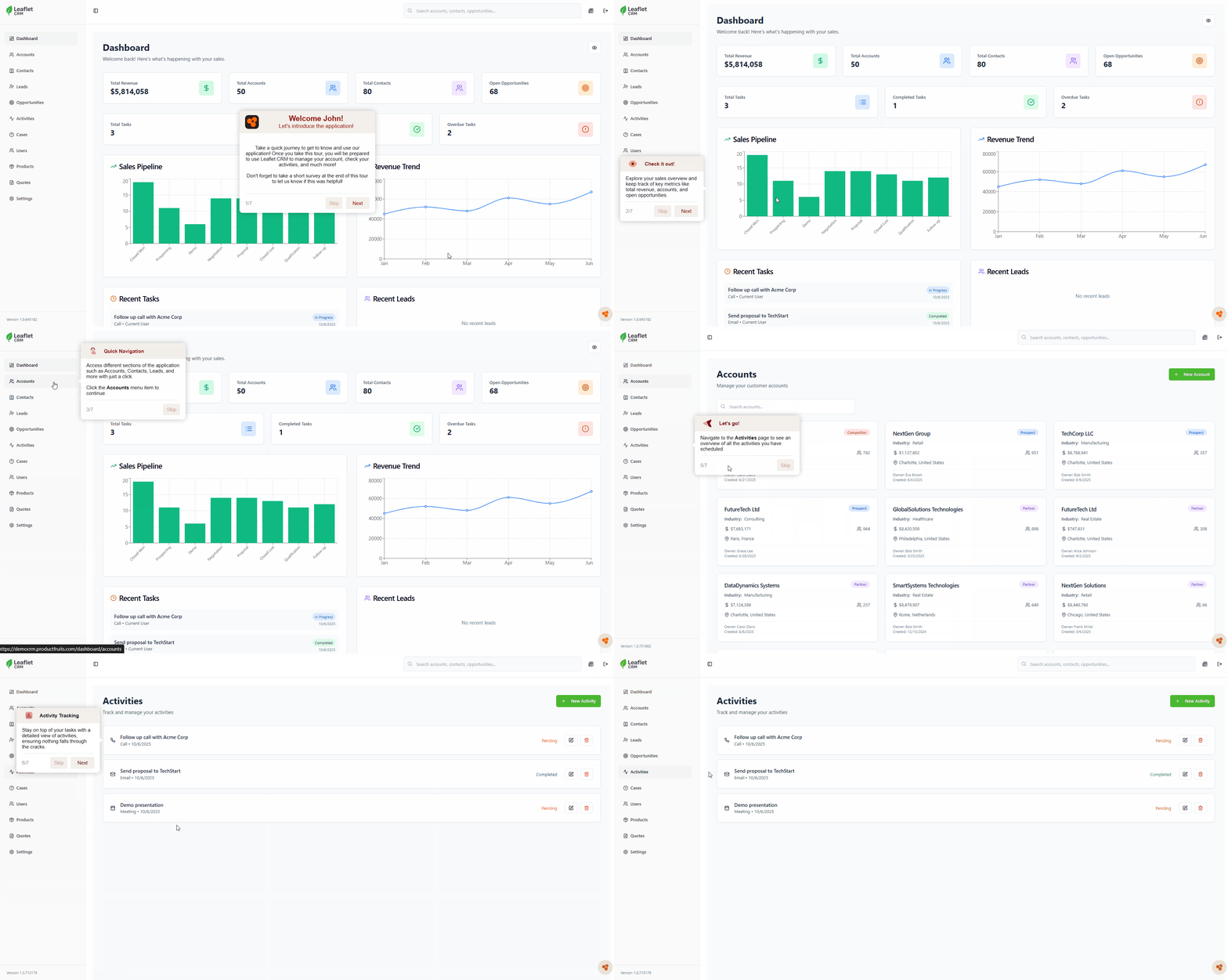
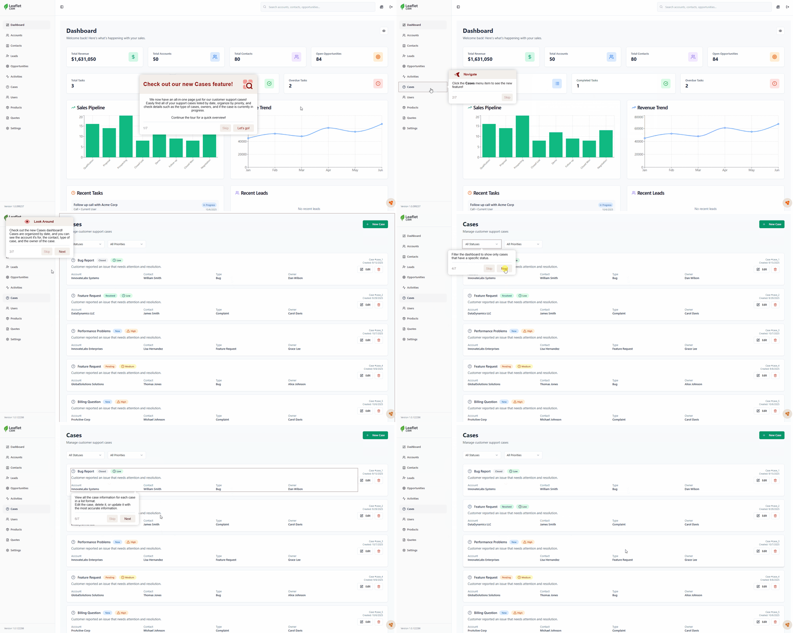
Tours Overview
Product Fruits makes it easy to create engaging, step-by-step Tours to guide users through your app. Tours help with onboarding, feature adoption, and user education. However, designing them effectively requires attention to detail and adherence to best practices. This guide provides a quick overview of creating effective Tours, covering design, targeting, customization, and advanced features like AI-generated tours.
How to Design a Tour
A Tour is a sequence of interactive cards that navigates users through specific features or workflows in your app. To design an effective Tour, keep these principles in mind:
Start Simple
Begin with a Welcome Tour instead of jumping straight into complex Feature Tours. Supplement it with Hints to guide users more gradually.
Keep It Short
Users are more likely to engage with Tours that are 4-5 cards long. For longer guidance, split content into shorter "mini-tours."
Make It Re-playable
Provide users the option to replay tours they skipped. The Life Ring Button is a great tool for this purpose.
Diversify Your Tools
Combine Tours with other features like Hints, Feedback, and Announcements for a comprehensive onboarding experience.
Types of Tours
Welcome Tour
Introduce new users with a friendly, 3-4 card sequence. Highlight your app's value with testimonials, videos, or key USPs.
Feature Tour
Teach users how to use specific features. Aim for 3-5 cards, or divide content into shorter, logical segments if necessary.
Advanced Tips for Tours
Use Hints as Links: Pair Hints with Tours by allowing users to click a Hint icon to start a related Tour.
Embed Links in Cards: Highlight text in a Tour card to link to another Tour or feature.
Connect Tours: Link smaller tours together for more complex workflows while avoiding fatigue.
Use Analytics: Track user interactions with Product Fruits Analytics to improve Tours and identify user needs.
Targeting and Selecting Elements
Product Fruits attaches Tours and Hints to elements in your app using CSS selectors. You can select elements using the visual helper in the editor or modify CSS selectors directly for more precise targeting.
Common Challenges and Solutions:
Dynamic Classes: Work with developers to configure more stable class names if dynamic ones are causing issues.
Selecting by Text: If elements lack unique selectors, targeting by text may be a viable solution.
Tour and Hint Card Customization
Product Fruits includes built-in card buttons for actions like:
- Previous card - Moves the tour to the previous step
- Skip - Skips the remainder of the tour
- Next - Moves the tour to the next step
You can also add custom buttons to trigger actions like:
- Starting a new Tour
- Opening a URL (with support for dynamic parameters)
- Redirecting users within the app
Tours and Hints can also be scheduled to appear at specific times, ensuring relevance and engagement.
AI-Generated Tours
Save time with AI-generated Tours. Product Fruits' AI can create templates and complete designs in minutes based on your app’s layout and highlighted elements.
Quick Overview: AI identifies and highlights key features automatically.
Introduce Features: Manually select elements to include, and AI will generate cards for each.
After generation, you can preview, edit, and refine the Tour in the editor to suit your specific needs.
Connecting Tours
Product Fruits allows you to create tours of any length. However, we've found that limiting the number of cards per tour works best in retaining the attention of your users. Generally speaking, we recommend around 5 cards per tour, but this can vary from application to application.
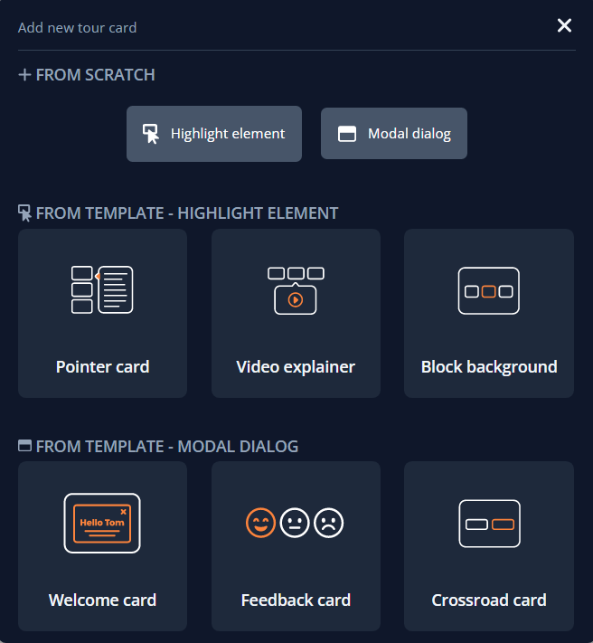
While there is no strict style guide in how you choose to structure your tours, variety will help keep your users engaged. It may be tempting to create tours using only the "Highlight element" feature, but this tends to make tours feel more one-dimensional. Consider varying the content of your tour using modal dialogues, video/GIF examples, breaking up content with hints, or using other preset tour templates provided by the Product Fruits editor.
Once you've become more comfortable creating tours, there are certain techniques that can be used to bend the 5 card rule. One such method is placing your user in a new environment. At the end of a 4-5 card tour, the Highlight element feature can be used to segue into another section of your application.
Keep in mind, this technique should be used sparingly in order to avoid user fatigue. Whatever approach you choose to take in building, always remember that there are no hard rules in design. Different tour lengths are going to be appropriate for different applications, and the best practices are conceptual- test designs first with employees, get feedback from users, and balance ideas with intuition. You know your application best. Product Fruits is designed to maximize its impact.
Next Steps
Learn the ins and outs of Tour creation with our Editor Tutorial Series which will walk you through creating and customizing Tours in Product Fruits:
- Step 1: How to target elements and build cards
- Step 2: Basic Settings
- Step 3: How to position and size your tour cards
- Step 4: How to create different layouts of tour cards
- Step 5: How to delay or hide tour cards, and other scenarios


