Hint Overview
Hints are small information cards that appear when users hover over or click an icon in your app. Unlike tours, which are typically seen once, hints remain available at all times. Hints work best when placed strategically throughout your app to explain features, guide users, or link to additional resources. They can contain text, videos, links to articles, or even interactive elements like surveys.
How to Design a Hint
You can create a new hint by navigating to Engage > Hints and working in the Product Fruits editor. From there, you can customize the content, appearance, and behavior of each hint.
Follow these principles when designing hints:
1. Add Hints Where Users Need Help
Unlike tours, which should be short and focused, hints work best when placed generously throughout your app. If an element requires additional explanation, consider adding a hint so users can access help instantly.
2. Keep Hints Clear and Concise
Users should be able to understand a hint in just a few seconds. Avoid long paragraphs—keep text short and to the point. If more details are necessary, link to an article, video, or tour for additional guidance.
3. Make Hints Interactive
Hints can do more than just provide information—they can guide users to take action. Add buttons that link to relevant pages, start a tour, or open an external resource like a help article.
4. Customize Hint Behavior to Improve Usability
Hints can be set to appear in different ways based on user behavior. You can:
- Make hints visible only on hover to keep the interface clean.
- Allow users to click an icon to view the hint when they need help.
- Set hints to disappear after being viewed so they don’t clutter the screen.
- Give users the option to dismiss hints permanently if they no longer need them.
By configuring these settings properly, you ensure that hints are helpful rather than distracting.
Types of Hints
1. Hints with Videos
Some features are easier to explain with visuals. Product Fruits allows you to embed videos directly into hints by linking to YouTube, Vimeo, or Loom. This is useful for onboarding new users or introducing advanced functionality.
2. Starting a Tour from a Hint
Hints can be linked to interactive tours, allowing users to start a step-by-step walkthrough when they need additional guidance. A common use case is adding a hint to a button, so when a user clicks the hint icon, it launches a related tour.
3. Linking Articles from a Hint
You can link a Knowledge Base article inside the hint if a feature requires more detailed documentation. This keeps support resources easily accessible while reducing the need for users to search for help manually.
4. Adding a Typeform to a Hint
Product Fruits supports integrating Typeform surveys inside hints. This is useful for gathering user feedback, conducting surveys, or asking follow-up questions about a new feature. Simply select Typeform in the editor and insert the link to your form.
5. Using an Adoption Meter
The adoption meter is a quick way to gather feedback on new features. Users can rate their experience directly from a hint, and you can review the results in the admin panel or export the data via the JavaScript API.
Reducing Screen Clutter
If you’re adding many hints throughout your app, it’s important to keep the interface clean. Here are some ways to prevent visual clutter:
- Use smaller icons – Reduce the size of hint icons to minimize their impact on the UI.
- Enable hover activation – Set hints to appear only when the user moves their cursor over an element.
- Use "Until Viewed" mode – Hide the hint icon after the user has interacted with it once.

4. Allow users to dismiss hints permanently – The "Dismiss Forever" option lets users remove a hint if they no longer need it.
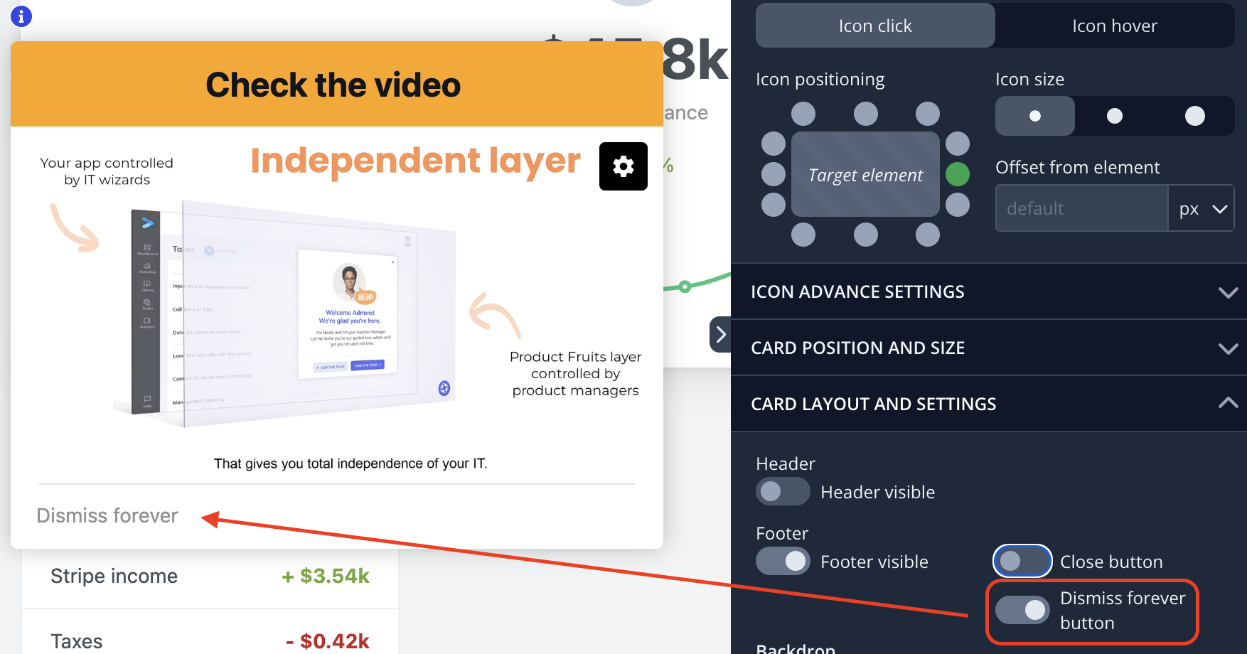
By combining these options, you can ensure that hints remain helpful without overwhelming the interface.
Scheduling Hints
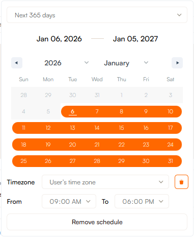
You can control when Hints appear by scheduling them in advance. This is especially useful for time-sensitive information, such as new feature rollouts or temporary announcements.
To schedule a Hint, set a start and end date in the editor. You can also use preset timeframes such as next 7 days, next 30 days etc. If no schedule is set, the Hint will remain visible indefinitely. You can also select a specific timezone to ensure that Hints appear at the right time for users in different regions.
Next Steps
Now that you understand how to design and use Hints effectively, you can start creating them in the Product Fruits editor. For a more in-depth walkthrough, check out our Editor Tutorial Series, where we guide you step by step through Hint creation and customization:
- Step 1: Targeting
- Step 2: Basic Settings
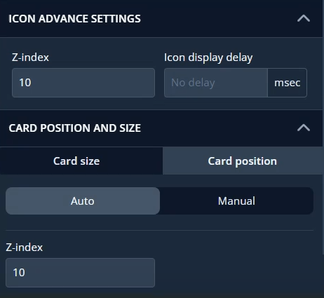
- Step 3: Icon Advance Settings
- Step 4: Card Position and Size
- Step 5: Card Layout and Settings
FAQ
Q: Why do hint cards flash when the visibility is set to on hover?
A: Hint cards may flash on hover due to an issue with their z-index. This typically happens when the z-index of the hint icon is lowered, and the z-index of the hint card unfortunately does not automatically adjust with it. Since the z-index determines the depth of elements on a webpage, if the hint card's z-index is not set higher than surrounding elements, the z-index of the hint icon may end up behind it. To fix this, ensure that the hint card has a sufficiently high z-index to prevent it from being positioned behind other elements. Learn how to set the z-index.