
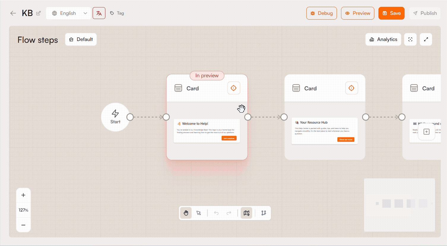
Flow Step Types: Card
Cards are the main building blocks of a Flow. They let you show instructions, guide users toward specific UI elements, collect interaction signals, and control how the Flow moves forward. This article explains how to attach cards to elements, define targeting rules, configure advance behavior, position cards on the page, style their appearance, and build card content with blocks.
Attaching a Card to an Element
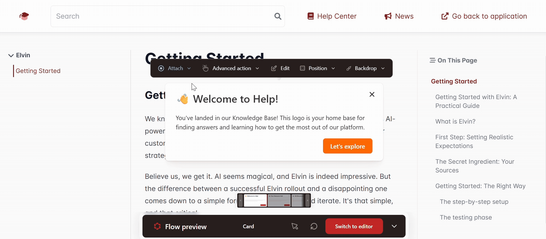
A card can either sit freely on the page or be anchored to a specific element: a button, a menu item, an input field, anything. When attached, the card will appear next to that element and visually point to it.
To attach or reattach a card, use the Attach control in the upper-right corner of the card, or find it in the preview panel, by clicking on the Attach toggle.
Targeting
Once a card is attached, the Targeting setting tells it exactly which element to look for on the page.
None means the card isn't attached to any element, it sits on top of your application.
CSS Selector is how the card identifies its target element. A CSS selector is a short string that describes an element's identity in the page's code, something like #submit-button or .nav-item. When you attach a card by clicking on an element in the preview, the selector is filled in automatically. If you need to find or adjust it yourself, right-click the element in your browser, choose Inspect, and the developer tools will show you the element's code where you can copy the selector.
Additional CSS Selector Options
Reposition around text
By default, the card positions itself relative to the full element. When this is on, it positions relative to the text inside the element instead. Helpful when the element is large but you want the card to point at a specific word or label within it.
Select by text
Instead of identifying an element by its code structure, this finds it by what it says. For example, rather than targeting a button by its CSS class, you can target it by its label "Get Started." Turn this on and fill in:
- Text Value: the text to look for.
- Contains: if on, it will match any element whose text includes your value, not just an exact match. If off, the full text must match.
- Case-sensitive: if on, "Save" and "save" are treated as different strings.
- Limit to CSS selector: narrows the text search to elements that also match a specific CSS selector. Useful when the same text appears in more than one place on the page.
Nesting level
Pages are built with elements nested inside other elements. This setting lets you walk up that hierarchy from the matched element. For example, if the selector lands on a small icon inside a button, you can set the nesting level to target the button itself instead.
Advance Action
The advance action is what causes the flow to move to the next card. By default it's a button click, but you can tie it to what the user actually does on the page.
Button
The user clicks the Next button on the card. This is the default.
On click
The flow advances when the user clicks the targeted element on the page. The card's button is not involved. Use this when a step is asking the user to click something specific in the UI.
On input
The flow advances based on what the user types into the targeted input field. There are three modes:
- Disable next button: the Next button is greyed out until the input condition is satisfied.
- First character: the flow advances the moment the user types anything at all. It doesn't matter what they type; this just confirms they've engaged with the field.
- Exact match: the flow only advances when the field contains a specific string. You can also require the user to press Enter before it checks, and toggle whether the match is case-sensitive.
Position
This controls where the card appears on screen.
You pick one of nine positions relative to the target element (top-left, top-center, top-right, and so on). This is your preferred position, if there isn't enough room for it, the card will shift to wherever it fits.
Card Layer
This controls how the card stacks visually against other elements on the page — specifically, whether it appears in front of or behind things.
Default: The card renders in a floating layer above the page. This works for most situations.
Match target: Use this when the card is attached to an element inside a modal or popup. Modals create their own stacking context, which can cause a default-rendered card to appear behind them. Match target makes the card follow the same stacking rules as its target element, so it stays visible.
Z-index
A number that controls exactly where the card sits in the stacking order. Every element on a page has a z-index; higher numbers appear in front of lower ones. Flow cards default to 10001010, which puts them in front of almost everything. You'd only need to change this if the card is covering something it shouldn't, or if you need it to sit between two specific elements. To find the right value, inspect those elements in your browser and pick a number between their z-index values.
URL Filtering
If you only want a card to appear on certain pages, or want to hide it on certain pages, URL filtering lets you define those rules.
You can:
- Add URL: Manually enter a URL
- Pick URL: Pick a URL in the editor, on the page where the card is displayed
Dynamic URL: If a URL contains parts that change depending on the user or context (like an account ID or a language code), use the [dynamic] keyword to represent those parts. For example, /app/users/[dynamic]/settings will match /app/users/123/settings and /app/users/456/settings equally.
Advanced
Display delay: Waits a set number of milliseconds before showing the card. Use this when the target element takes time to appear after the page loads, an animation finishing, a component rendering, a widget loading from a third-party script. If the card tries to attach before the element exists, it won't work correctly.
Advance on element removed: Automatically moves to the next card when the targeted element disappears from the page. Useful when the flow is tied to an interaction that causes the UI to change, like submitting a form that hides a panel.
Advance if element is missing: If the targeted element simply isn't on the page when the card is supposed to appear, this moves the flow forward instead of getting stuck. You can set a delay in milliseconds to give the page a moment to finish loading before it gives up and skips ahead.
Card Appearance
Base colors
These apply across the whole card:
- Primary: the color of buttons.
- Secondary: used for secondary button styles and accents.
- Text: the color of all body text on the card.
- Background: the card's background, which can be a solid color, a gradient, or an image.
Block-level overrides
Clicking directly on a text or media block inside the card reveals additional settings scoped to just that block: background color, text color, and padding on each side.
Button settings
Clicking a button field opens its settings:
- Alignment: left, center, right, or full width.
- Style: primary, secondary, or outline. These reference the base color settings above.
- Colors: independent overrides for the button's border and text color.
- Border: corner rounding and border width.
- Font size and padding.
- Button action: what happens when the button is clicked:
- Advance — moves to the next card.
- Close / Dismiss — ends the flow.
- Go to step — jumps to a specific card in the flow by step number.
- Branch — routes the user down a different path depending on a condition.
- Open URL — navigates to a URL.
- Open URL and advance — opens a URL and continues to the next card.
- Open URL and dismiss — opens a URL and ends the flow.
Dismiss button
When enabled, an X button appears on the card so users can exit the flow at any point. Dismissing is not the same as completing, the flow will reappear the next time its trigger conditions are met. You can adjust the button's position relative to the upper-right corner of the card and change its color.
Backdrop
The backdrop draws focus to the targeted element by affecting the rest of the page visually.
None: No backdrop. The page looks and behaves normally while the card is visible.
Darken: A dark overlay covers the entire page except for the area around the target element, which stays fully visible. You can set the overlay color, its opacity, and how rounded the cutout edges are.
Glow: Instead of darkening the page, a glow is applied around the target element to draw attention to it. Same configuration options as Darken.
Block clickthrough: When on, users can only interact with the card itself. Everything else on the page becomes unclickable. When off, users can still interact with the page while the card is visible. This setting is independent of the backdrop — you can block clickthrough without any backdrop, and vice versa.
Highlighter ring: Draws a visible ring around the target element. You can set the ring's thickness, color, and how rounded its corners are.
Content Blocks
Blocks are the pieces of content that make up a card. Add them by dragging from the block panel into the card.
Image
Upload your own file or generate one using the built-in AI tool. GIF files are supported. Once added, you can configure the background behind the image, how it fits in the space (Cover fills the area and may crop the image; Contain fits the full image in the space and may leave empty space around it), its position, height, rotation, and padding. You can also add alt text for accessibility.
Video
Paste a link from YouTube, Vimeo, or Loom. No other sources are supported at this time. You can set the background color, height, and padding.
Content
A standard rich text block for body copy. You can use Elvin to help with writing, or press / for formatting options.
Button row
An additional row of buttons below the main content. Configured the same way as the primary buttons.
Divider
A horizontal spacer between blocks. Set its height, horizontal padding, and color. If you turn on Show line, a visible rule appears inside the divider with its own thickness and color.
Custom HTML
Paste in any HTML snippet and it will render inside the card. A set of presets is available to start from. Use this when the standard blocks aren't enough, for embedded forms, custom animations, third-party widgets, or anything else that requires custom code.
User Input
The User Input step collects responses from your users and stores them as variables you can reference later in the flow. From a dropdown list in the step editor, you choose one of three input types: Text input, Single-select, or Multi-select.
Text input
Presents the user with a free-form text field. You can enable the multiline toggle if you want to allow longer responses.
- Placeholder: the hint text displayed inside the field before the user types anything
- Variable name: where the answer is stored. Reference it later in the flow as
{{flow.vars.<name>}} - Description: not shown to your end users; used to tell the AI what this step is collecting
- Required: toggle on to make this field mandatory before the user can proceed
Single-select
Presents the user with a dropdown list of options, from which they can pick only one.
- Variable name: where the answer is stored. Reference it later in the flow as
{{flow.vars.<name>}} - Description: not shown to your end users; used to tell the AI what this step is collecting
- Required: toggle on to make this field mandatory before the user can proceed
- Options: add or delete choices and set a custom value for each one
Note that in the editor the dropdown list is visible but not interactive — you can only select an option when viewing the flow live.
Multi-select
Unlike single-select, multi-select does not appear as a dropdown. Instead, all options are displayed directly on the card, each with a checkbox, allowing users to pick more than one answer.
- Variable name: where the answer is stored. Reference it later in the flow as
{{flow.vars.<name>}} - Description: not shown to your end users; used to tell the AI what this step is collecting
- Required: toggle on to make this field mandatory before the user can proceed
- Options: add or delete choices and set a custom value for each one
Preview
Individual cards can be previewed to see how they would appear on specific mobile devices. Open the preview for any card to select a device and check the layout before publishing.
The following devices are currently supported:
iPhone
- iPhone 13
- iPhone 13 Mini
- iPhone 13 Pro
- iPhone 13 Pro Max
- iPhone 15
- iPhone 15 Pro
- iPhone 15 Pro Max
- iPhone 16 Plus
- iPhone 16 Pro
- iPhone 16 Pro Max
Google Pixel
- Pixel 6
- Pixel 6 Pro
- Pixel 8
- Pixel 8 Pro
Samsung
- Galaxy S22
- Galaxy S22+
- Galaxy S22 Ultra
- Galaxy S24
Tablets
- iPad Pro 11"
- Samsung Galaxy Tab S9
- Samsung Galaxy Tab S9+
- Samsung Galaxy Tab S9 Ultra